Taiwan’s first city font, launched alongside the new visual identity system of Chiayi City, was unveiled at the end of May 2022. justfont is honoured to have played a role in designing this gift for the world from Chiayi City. This project also marks the latest achievement of our jf+ brand consulting services, following our previous work on the logotype design for Greenvines.
A year prior to the release of Chiayi City Font, the team responsible for this identity system update, IF OFFICE, approached justfont with the need to create a set of Latin characters that could also be used in signage. We could not refuse such a meaningful and challenging project!
However, before diving into the design, the designers had first to understand: Who is Chiayi City?
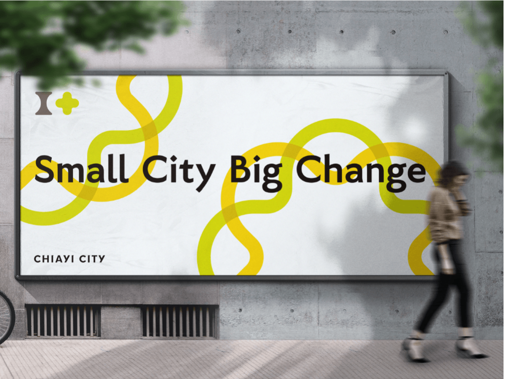
Imaging Chiayi City
When people think of Chiayi City, what comes to mind? Turkey rice? Fish head casserole? Beimen Train Station? The research conducted by IF OFFICE for this identity system update revealed that Chiayi City is much more than that.
After interviewing Chiayi City government officials and residents, IF OFFICE identified key descriptors such as “mature and intellectual,” “calm and reserved,” “friendly and passionate,” “inclusive and diverse,” and “appreciative of history and art.” They also captured the aspirations of the citizens and the government for the future of Chiayi City: diversity, innovation, and a city suitable for all generations.
These keywords represent the impressions of local residents and resonate with the project’s primary designers. Hao-Mei Wang, who stayed in Chiayi City for a week, observed the city’s rich cultural and historical atmosphere, even though her experience was limited due to the pandemic. Rong Tseng, who had heard about the literary and artistic figures from Chiayi since his university days, felt a connection between Chiayi City and his time studying in Kyoto, noting that both cities possess a deep, understated cultural richness. He remarked, “Chiayi City feels a lot like Kyoto.”
From IF OFFICE’s research and the designers’ personal experiences, we distilled several key design directions: stable, intellectual, elegant, and friendly, along with some fundamental requirements: 1) It had to match IF OFFICE’s chosen typeface, Noto Sans TC; and 2) It needed to be suitable for signage.
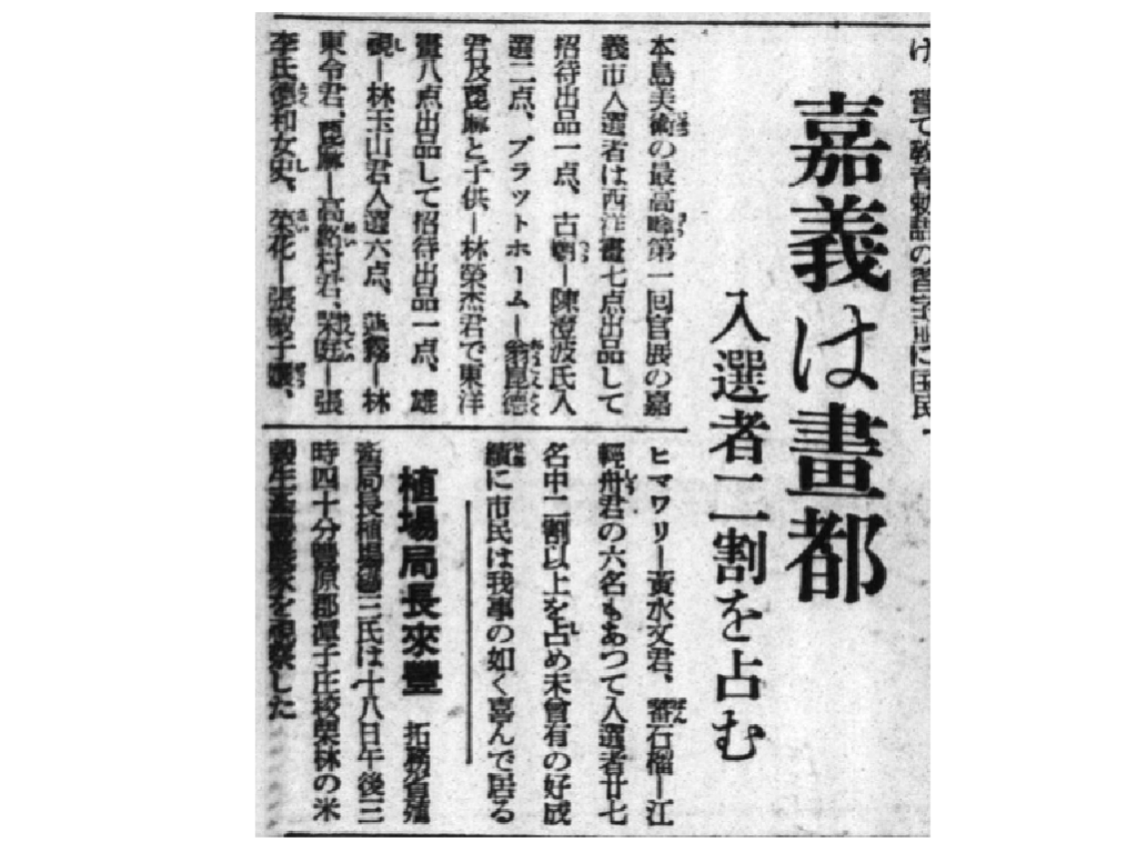
Proposals from justfont
The designers engaged in extensive discussions to determine the basic design direction based on the requirements. Firstly, the typeface needed to be sans-serif to complement Noto Sans TC, with the characteristics of particularly minimal variation in stroke thickness. Secondly, given its application in signage, the font might be used in road signs, interior building signs, and even smaller printed materials, requiring careful selection of stroke weight. Ultimately, we decided to create a bold style that would be easily readable from a distance, with a focus on the clarity of stroke shapes and structure. With this in mind, four colleagues presented the following proposals:
Proposal A: Calligraphic Strokes, Classical Proportions by Rong Tseng
Drawing on classical Roman proportions, this proposal reinterprets the forms and lines of Western calligraphy to embody the cultural depth of Chiayi City. It pays homage to Edward Johnston, the father of modern Western calligraphy, aiming for the timelessness of this city typeface.
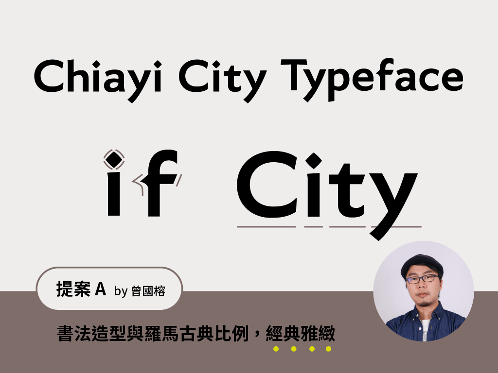
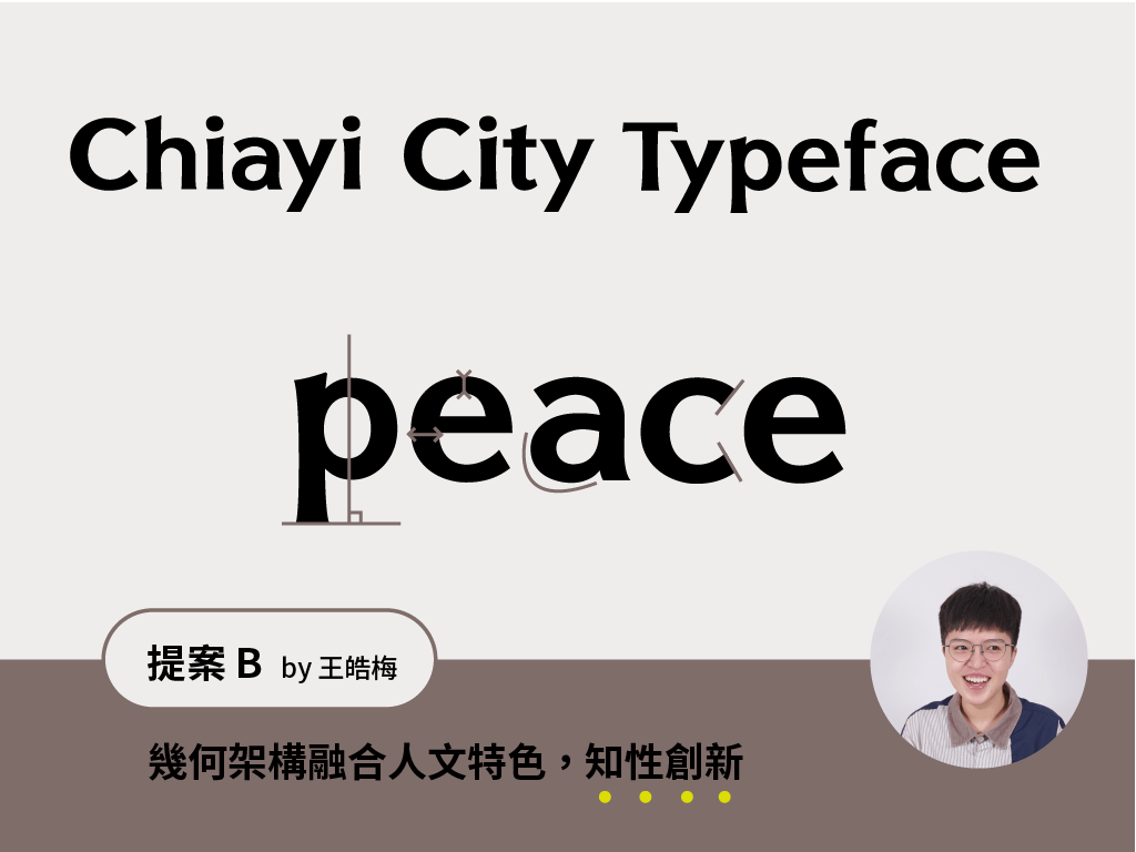
Proposal B: Geometric Structure, High Readability by Hao-Mei Wang
This design employs a geometric structure while retaining humanistic curves and contrast in stroke thickness, reflecting Chiayi City’s warmth, intelligence, and vibrancy. The x-height is increased, and the apertures are widened to enhance legibility, particularly in signage scenarios.
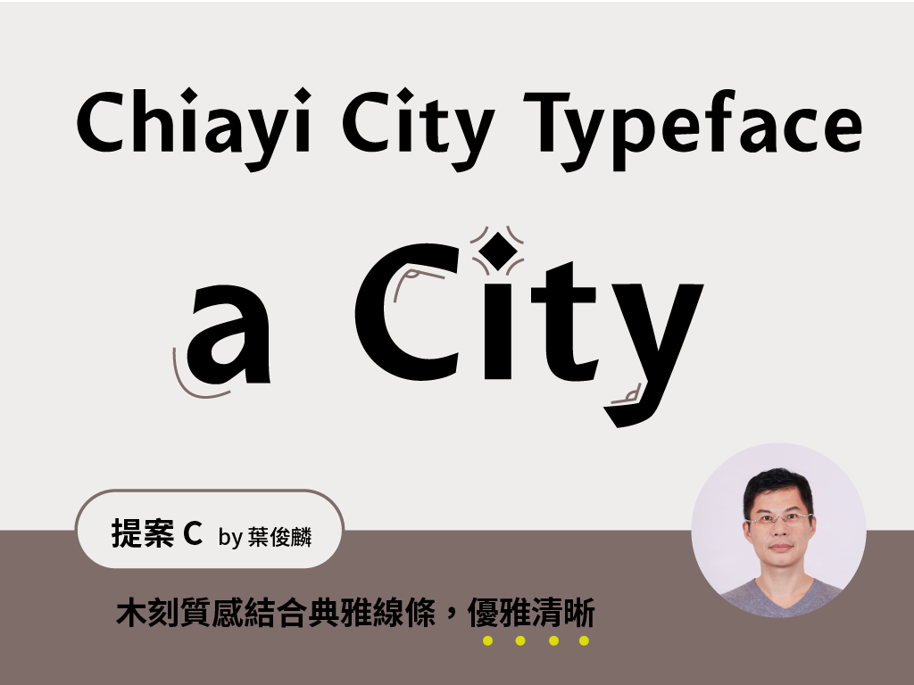
Proposal C: Woodcut Lines, Elegant and Clear by Michael Yeh
Inspired by the Alishan Railway, which starts from Chiayi City, this proposal emphasises the city’s image as the “Wood City.” It merges elegant humanistic curves with woodcut-like lines, combining style with functionality.
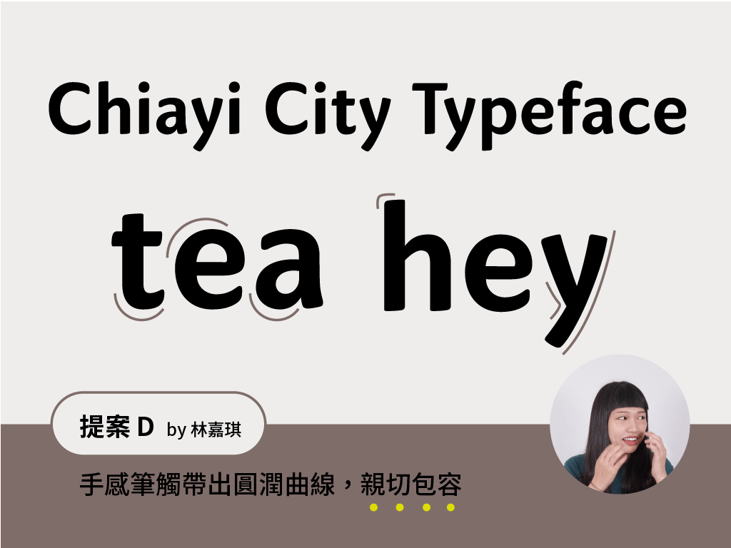
Proposal D: Rounded Curves, Handwritten Feel by Jia-Chi Lin
This design uses rounded curves and a solid feel to portray Chiayi City’s passionate image. The soft texture also evokes thoughts of Chiayi’s food and climate, with the hope that everyone who sees this typeface will feel embraced by the warmth of the city.
Each of the four proposals met the project’s needs and had its own unique character. The designers also carefully selected the display samples, representing the typeface and including the design details, showcasing what the typeface might look like upon completion. After presenting the four designs, the Chiayi City Government and IF OFFICE responded enthusiastically. Although each proposal had its supporters, the final decision was to develop a typeface based on the more functional Proposal A and Proposal B.
This might sound straightforward, but the process was actually quite challenging. Proposal A and Proposal B had different design concepts: the former focused on a calligraphic feel, while the latter emphasised geometric form. The two styles were quite different, and combining them without losing their individual essence required much careful coordination. After numerous internal discussions at justfont and several rounds of feedback with the Chiayi City Government and IF OFFICE, we finally completed this pioneering city font for Taiwan.
justfont’s First Latin-Only Font
At this point, some readers might wonder: Aren’t you a company specialising in Chinese typefaces? Why did you create a Latin typeface?
Indeed, we are primarily a Chinese typeface company, but all our previous typefaces have included Latin characters. Perhaps people were so focused on the Chinese characters that they overlooked this aspect! This is also part of the challenge for Chinese typeface designers: not only do they have to design Chinese characters, but they also need to create complementary Latin letters to meet contemporary needs. The design considerations for Latin and Chinese characters differ significantly.
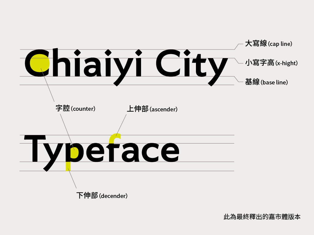
For example, unlike Chinese characters, Latin characters don’t have a uniform, square-like framework, and the kerning between letters varies. These details deeply affect the rhythm and readability of Latin text. However, for non-native speakers of Latin languages, these nuances can be hard to detect, requiring designers to make meticulous adjustments. The final version of the Chiayi typeface adopts classical Roman proportions, making the unequal width of the Latin characters more prominent, thus enhancing its humanistic feel.
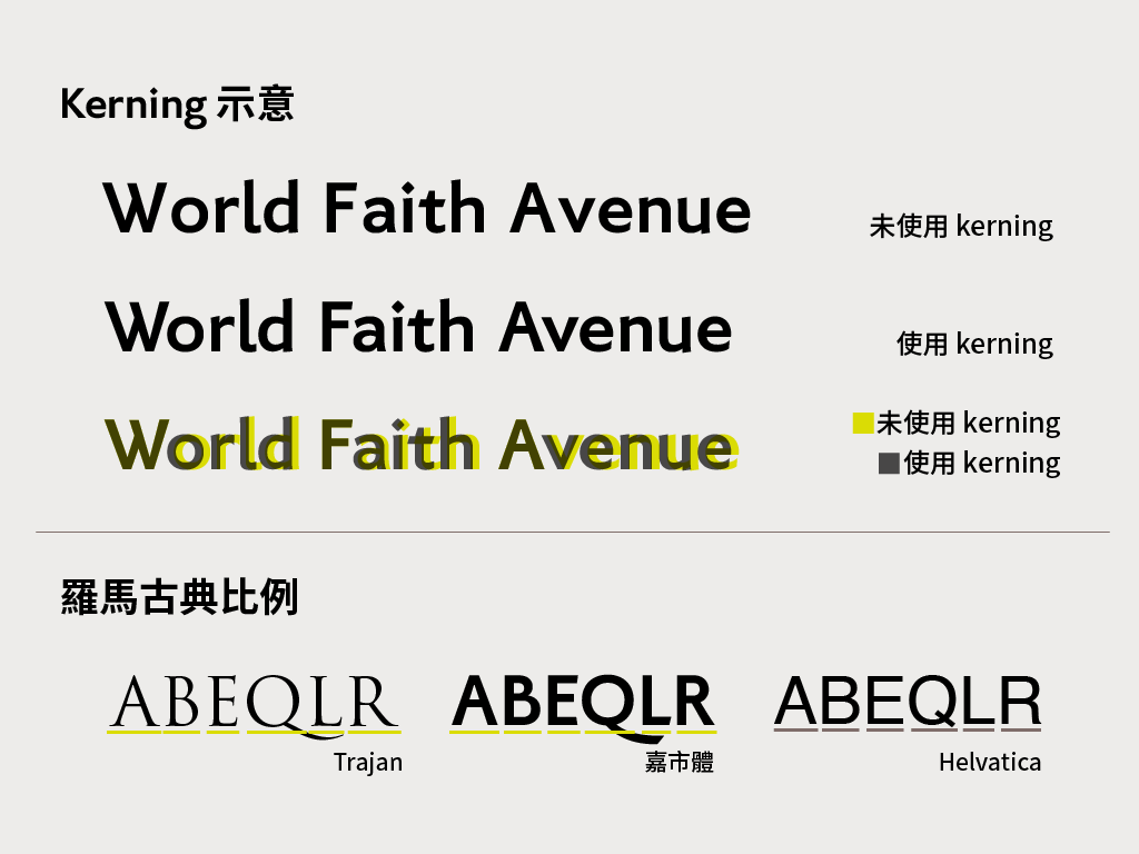
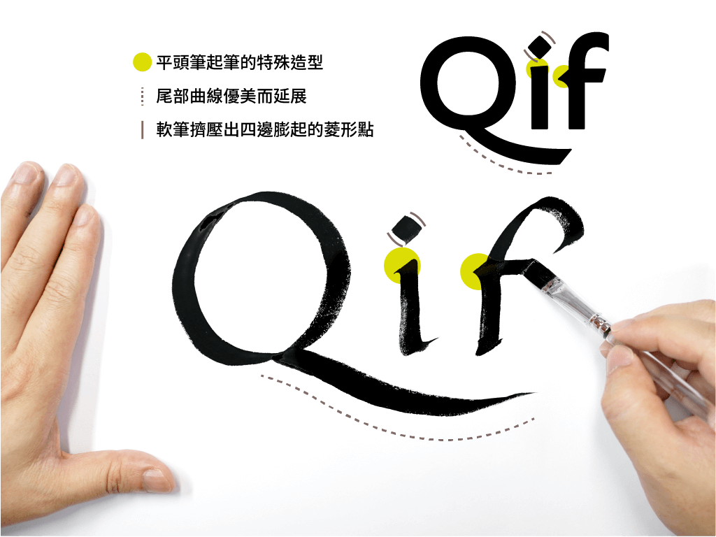
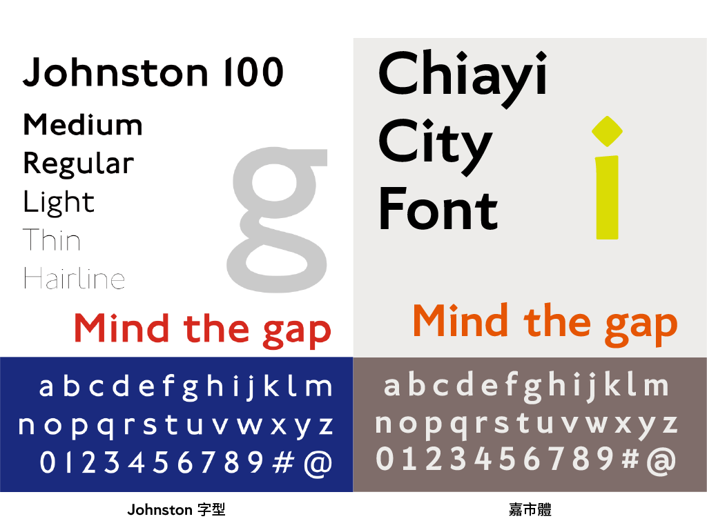
In addition to conveying a sense of humanism through its proportions, the humanistic quality of the Chiayi City Font also derives from the classic forms of Western calligraphy. While designing this typeface, Rong Tseng paid homage to Johnston, the father of modern calligraphy, hoping that the Chiayi City Font could become as iconic as the London Underground typeface designed by Johnston, embedding itself in the landscape of the city. Modern Western calligraphy features distinctive characteristics such as diamond-shaped dots that slightly bulge at the corners and an elongated tail on the letter “Q.” To ensure that the digital font retained the natural handwritten lines, the designer had to return to pen-and-paper writing, experimenting repeatedly before refining the design on a computer to create the final version of the Chiayi City Font that you see today.
Looking Towards the Future with Chiayi City Font
The Chiayi City Font, as Taiwan’s first city font, carries significant historical and cultural meaning. However, simply bearing the name of a city does not make a typeface a true city font. The completion of a city typeface is not just about its release; we hope that this font will grow with Chiayi City as it moves towards a more diverse, innovative, and livable future.
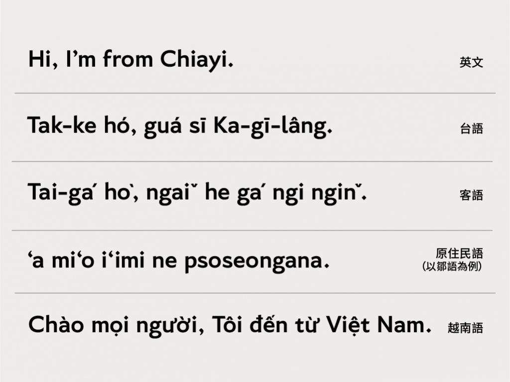
The Chiayi City Font not only attempts to reflect Chiayi City’s cultural characteristics through design but also showcases the city’s diversity by including a variety of languages in its character set, such as Taiwanese, Hakka, indigenous languages, and Vietnamese. justfont has always made the inclusion of Taiwan’s local languages a fundamental requirement in our typeface designs, and the addition of Vietnamese in this project serves the needs of Chiayi City’s major immigrant population. Through the inclusion of these languages, we hope this font will, like Chiayi City itself, embrace a future of greater diversity, innovation, and livability.
The Chiayi City Font is imbued with the city’s depth and character and our vision for a better typographic landscape, but its true value lies in its usage and connection with the city. To ensure that everyone understands the font’s origins, design details, and usage guidelines, justfont has created a comprehensive usage manual, and we look forward to seeing the Chiayi City Font widely (and correctly) used soon.
Finally, we ask for a small favour: If you spot the Chiayi City Font during your walks around the city, whether on road signs, menus of street food vendors, or advertisement billboards, please snap a photo and upload it to Instagram with the hashtag #chiayicityfont. Let’s work together to make Chiayi City Font part of the city’s landscape, etched into everyone’s imagination of Chiayi.
This is a translation base on 嘉市體:台灣第一套城市字型的誕生, with the help of chatGPT.

