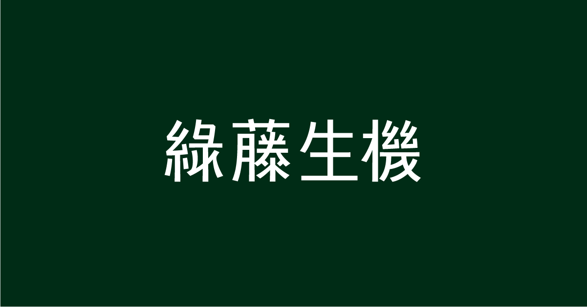
Logotype is the first impression for customers. For Greenvines (綠藤生機), a skincare brand, the brand refreshing project aims to omit the image logo and place the logotype as the primary identifier, underscoring the importance of type design. While an international design team had already been enlisted to handle the brand’s global image and the English logotype had been chosen, the Chinese logotype required a different approach. It was essential to have someone who understands the intricacies of Chinese characters to design it, offering a greater sense of assurance.
The founders of Greenvines approached justfont directly, resulting in justfont’s first-ever logotype project.
We said yes, for educational purposes
However, an initial challenge was: “We don’t actually specialise in logotype design…” After all, justfont’s focus is on typographic education and font design.
Designing a set of Traditional Chinese font typically involves thousands of characters, emphasising structural consistency and ensuring the font works seamlessly across various contexts. On the other hand, a standard logotype involves designing only a few characters, allowing for more graphical creativity—it is both text and logo. It is specifically designed for brand identification. Designing a logotype for another brand was not within our usual scope of work.
Nevertheless, thinking from another perspective, the intricate nuances of font design can be challenging for the average person to grasp, requiring a certain level of expertise to understand the various design considerations. A logotype is different. It takes centre stage as the focal point of recognition, offering a larger canvas for visual expression and higher visibility. In other words, it resonates more with people.
If creating impactful logotypes could help more people understand the significance of typography, it would be a worthwhile effort. Driven by our vision of a better typographic landscape, we stepped out of our comfort zone and were honoured to collaborate with Greenvines, creating our first logotype design.
Moving forward, we will continue to focus on our core business but are eager to collaborate with more brands that share our vision for innovative type design. (For more information, please search for jf+, brand consulting services we launched after the Greenvines project.)
Translating “The Code of Nature” through Typography
The task of creating the Greenvines logotype differed from our usual work in font design, and the challenge wasn’t primarily technical.
Font designers are trained to achieve subtle visual balance, with consistency being a key strength. As a result, they are well-equipped to create highly recognisable fonts that are legible in any size. However, extending this to encapsulate brand spirit requires creativity and effective communication to understand what the client wants truly.
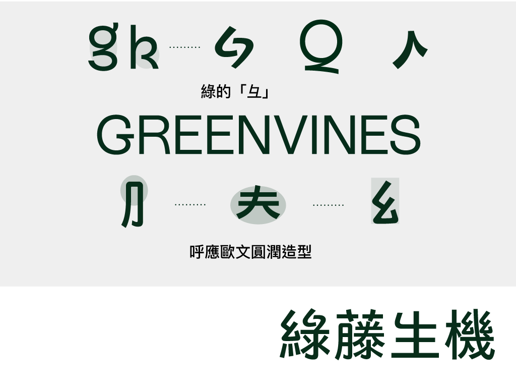
For this new brand identity, Greenvines embraced the concept of “more is less” at its core with “The Code of Nature,” exploring the inherent order behind the complexity of nature. Upon closer examination, subtraction often proves to be the answer, echoing Greenvines’ longstanding belief in skincare: “The right choice doesn’t need to be excessive.” But subtraction doesn’t mean boring. The typeface used in the identity system, Rebond Grotesque, might initially appear like a common sans-serif (e.g., Helvetica), but its design features playful and unexpected elements in characters like Q, K, r, and g. It’s simple at a glance yet full of creative details upon closer inspection.
The central challenge of designing the Chinese logotype was to “translate” this spirit from the Latin alphabet to Chinese characters. The result needed to convey a similar vibe and characteristic details while adhering to the principles of Chinese writing, achieving distinctiveness, and embodying the brand’s spirit. This is quite different from the usual challenges of font design. Additionally, the characters “藤” and “機” are complex, requiring the designers to simplify them while retaining memorability—an actual test of the designers’ skill in subtraction.
Four colleagues at justfont were involved in the project, each proposing designs based on their own understanding of the brief, with feedback from the client guiding the process. Following typographic principles, the team first experimented with stroke weights that would complement the Latin characters before beginning the design work.

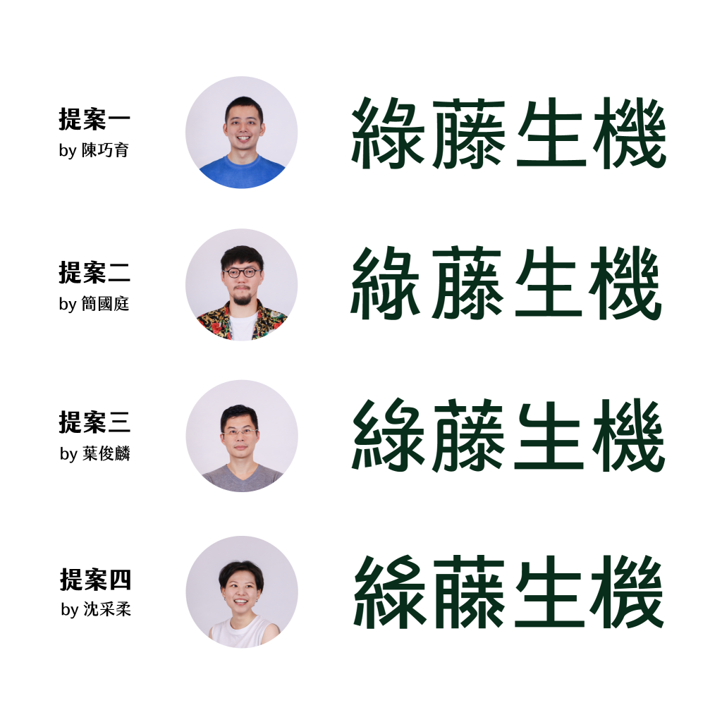
Drawing from Latin Elements
After observing the Latin details, it was time for each designer to apply their creativity. Each designer focused on different aspects and came up with unique ideas—
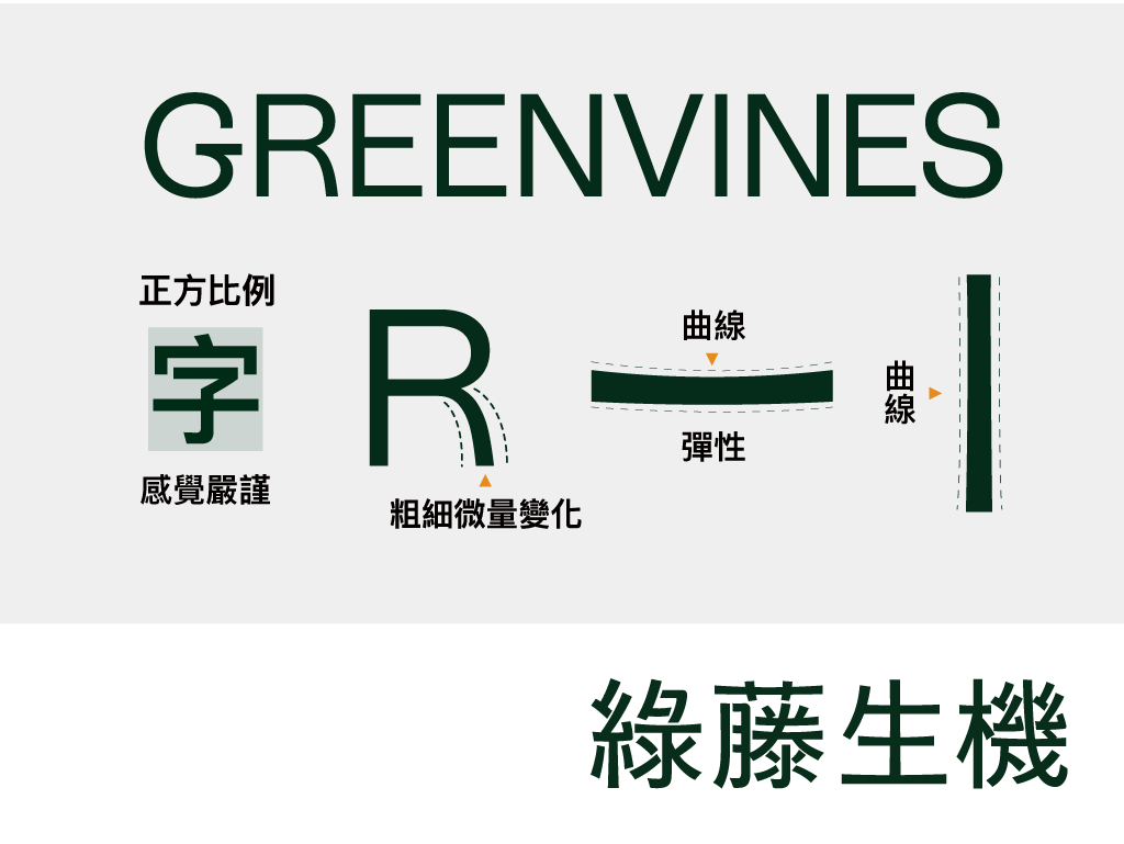
Proposal 1: Inspired by Stroke Weight Variation
Seed Chen (Multimedia Designer) observed the varying stroke weights in characters like R and proposed incorporating similar variations in the Chinese characters, which would also align with Greenvines’ natural imagery.
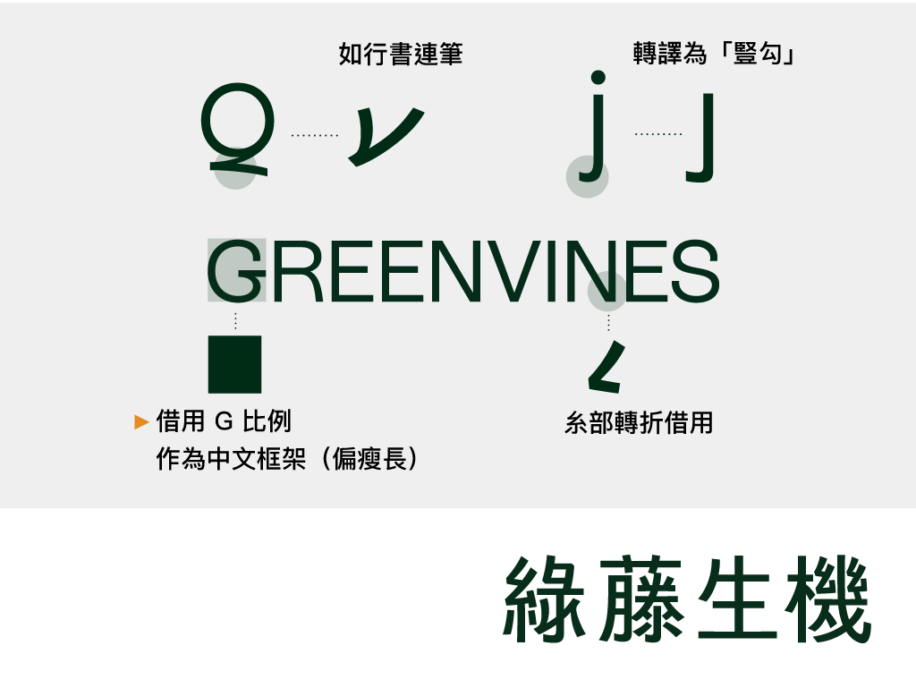
Proposal 2: Extracting Elements from J, Q, N
Bold Chien (Font Designer) was inspired by the hook in J, which can be paired with the vertical hook in Chinese, and the tail of Q, which resembles the running script in Chinese calligraphy. The turning structure in N can also be used in Chinese. He then proposed a slender, high-centred design and based the width on G.
Proposal 3: Digesting the Curved Form of g and k
Michael Yeh (CEO & Project Lead) applied the curves of g and k to the “彑” in “綠” and drew on the rounded overall impression of Rebond Grotesque to create a more rounded Chinese appearance.
Proposal 4: Adding Visual Creativity
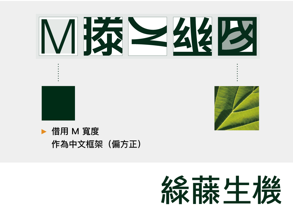
Tsai-Jou Shen (Typeface Designer) incorporated the observations from the Latin letters and used M as a structural reference to develop a more squared look. In “機,” she added a tiny “sprout” detail, reducing the strokes for higher legibility.
How Did Greenvines Respond?
The four proposals sparked lively discussions within the Greenvines team. The overall direction met their expectations, focusing on using Heiti (a style similar to Sans-Serif) as a foundation to find creative space within a stable and balanced framework, though further refinement was needed. Greenvines’ co-founder, Harris Cheng, stated: “In the next ten years, Greenvines aims to move towards a simpler, more mature direction.” Following this integration of ideas, proposals two and four were selected for further refinement.
As mentioned, the characters “藤” and “機” are relatively complex in terms of stroke count, so the simplification and visual elements in proposal four were favoured. Proposal two was also chosen for its slender, slightly higher-centred design, aligning with the brand’s evolution and current consumer preferences. After the proposal was completed, designer Bold Chien proceeded with the integration.
Incorporating Advantages and Making Trade-offs
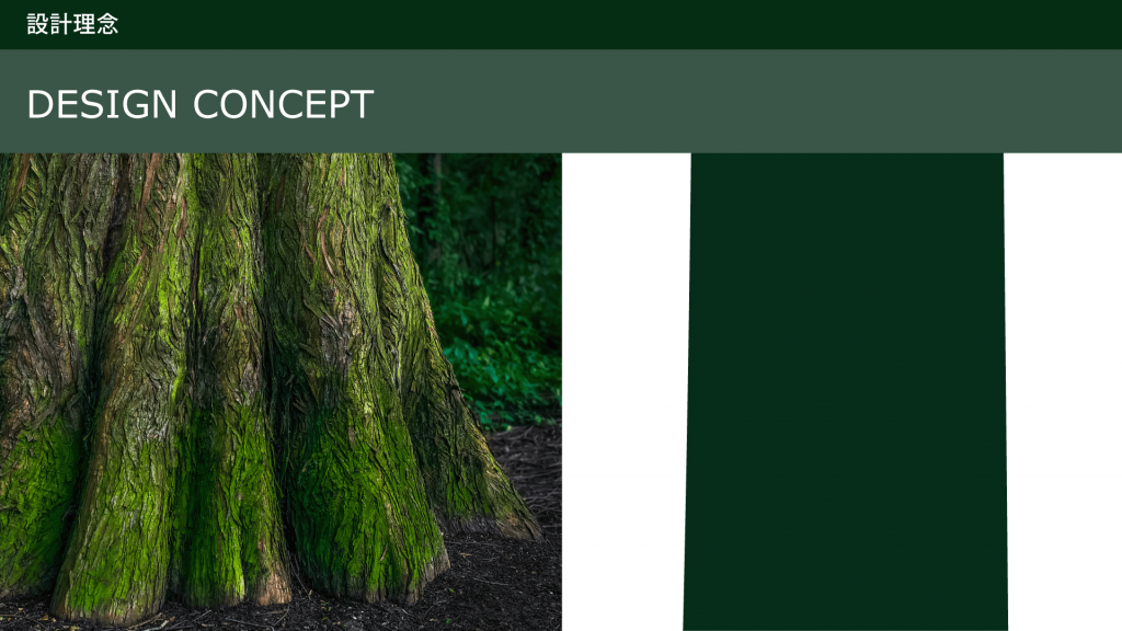
The direction aimed for simplification and elegance, ensuring that the design would remain trendy even in the next decade. Based on proposal two, elements from proposal four were integrated: omitting hooks, incorporating a sprout design, simulating tree trunks (also helping to stabilise the characters), and removing the right dot from the “木” radical in “機.” This simplification didn’t compromise readability but enhanced overall recognition when the brand logotype is used on very small scales.
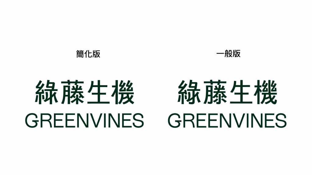
In font design, removing a “dot” without a solid design reason is unacceptable, akin to creating a typo. However, when considering a brand’s logotype, the considerations are different. As logotypes are closer to imagery, they allow more room for stylistic expression. The brand must then consider whether customers will appreciate the design’s excellence rather than just seeing it as “wrong.” To cover all bases, designer Bold Chien also provided a less stylised “regular” version for the Greenvines team.
Ultimately, we were pleased that Greenvines embraced creativity and challenge conventions by opting for the most streamlined and image-like version as their brand representative for the next decade.
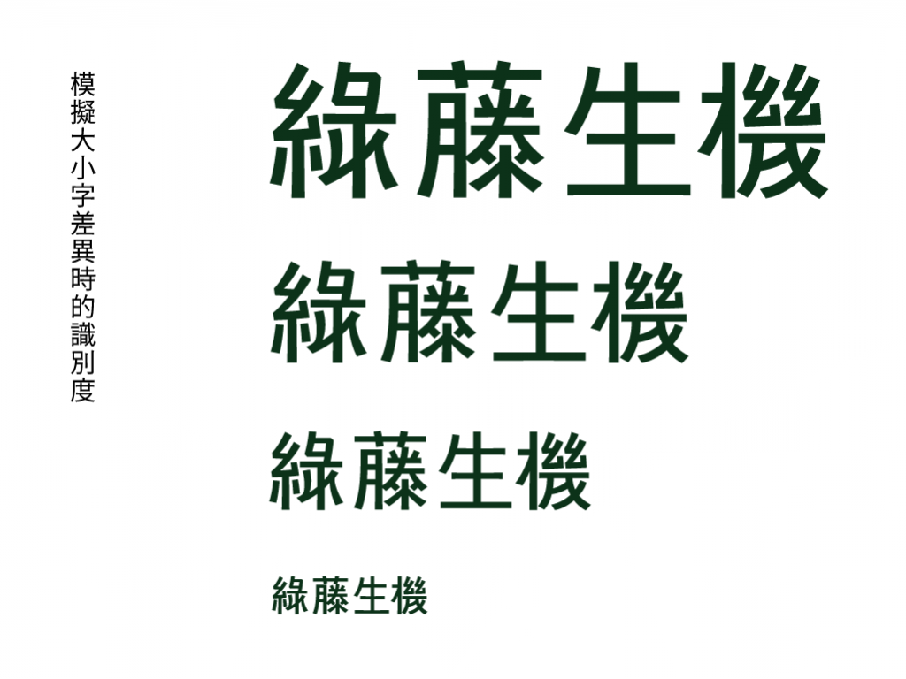
A Few Minor Adjustments
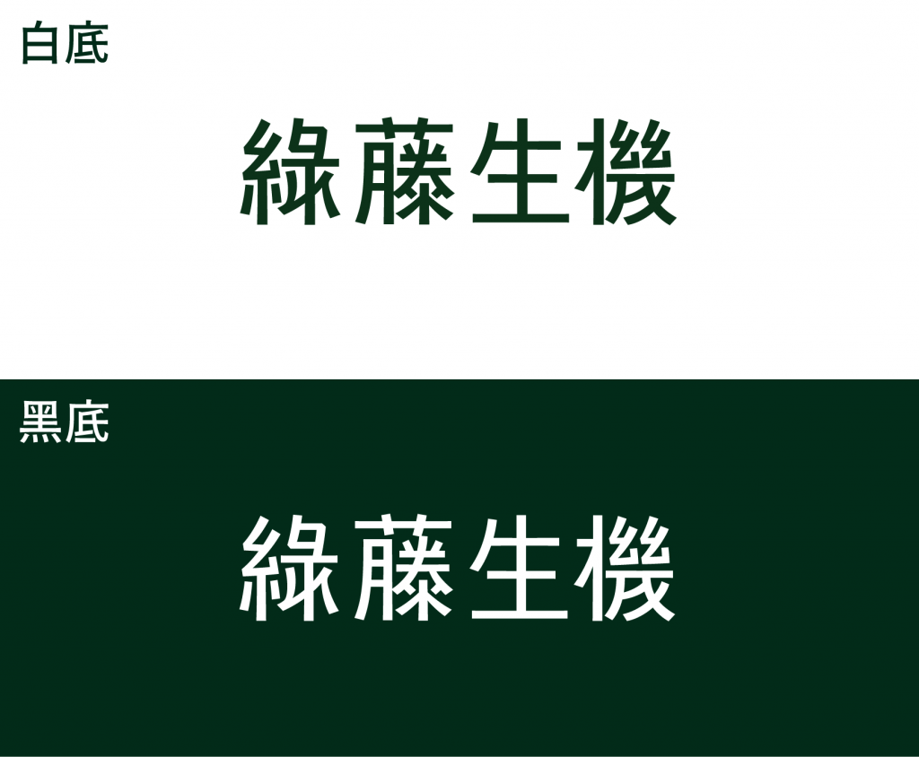
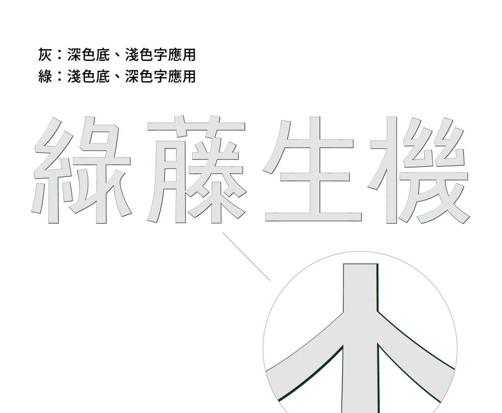
As a team specialising in font design, we need to ensure quality for our clients in certain areas—such as adjusting the typeface for dark and light backgrounds and fine-tuning it for screen and print applications. For instance, on screens with a dark background and light text, the light text may appear thicker than usual, so a thinner version is used to maintain the typical appearance.
Afterword
After the release of the new Chinese logotype for Greenvines, justfont initially shared the news on Instagram stories, engaging with our followers and receiving enthusiastic feedback. At first glance, it seems we’ve achieved our goal of using the standard logotype to raise awareness of typographic issues. We also hope that through this visual identity, Greenvines can further clarify its “more is less” philosophy.
This article was translated from 減法先決:新一代綠藤標準字 with the help of ChatGPT.
