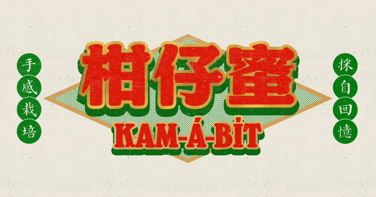
Note: Kam-á-bi̍t is the Taigi (Taiwanese Hokkien) pronunciation of tomato (柑仔蜜), reflecting the typeface’s connection to Taiwan’s local culture and language.
justfont’s newly released typeface Kam-á-bi̍t draws inspiration from vintage storefront lettering art, carrying a classical aesthetic. However, rather than merely recreating these signage styles, it has been meticulously crafted into a fresh design that meets modern needs.
Bridging the gap between hand-drawn traditional signage (with its inherent imperfections) and standardized digital typefaces proved to be a significant challenge. Designer Tsai-Jou Shen spent considerable time wrestling with this balance.
Vintage Signs and Book Covers: A Timeless Appeal
Initially, Shen didn’t study old storefront signs with the intention of creating a typeface.
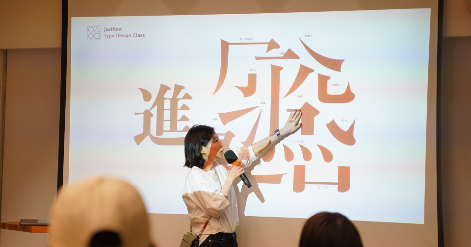
As an instructor at justfont’s Type Class, she noticed that students’ biggest challenge was “design ideation.” Among various approaches to design ideation, street observation is one method. To provide students with reference materials, Shen began collecting and studying vintage storefront lettering styles.
Going beyond just collecting references for students, she led by example and attempted to create characters inspired by these signs. This helped her understand the challenges her students might face during ideation and creation. What started as a teaching tool evolved into an increasingly fascinating project, eventually leading to a new typeface proposal.
What Makes Traditional Signage Unique?
When discussing Taiwanese storefront signs today, many might think of the ubiquitous Kai-style (Regular Script) lettering. These signs commonly use characters from Liu Yuan-Xiang’s “Commercial Character Collection” (商用字彙), which has become a distinctive feature of Taiwan’s streetscape, setting it apart from other regions using Chinese characters. This style has also influenced many digital Kai-style typefaces available today.
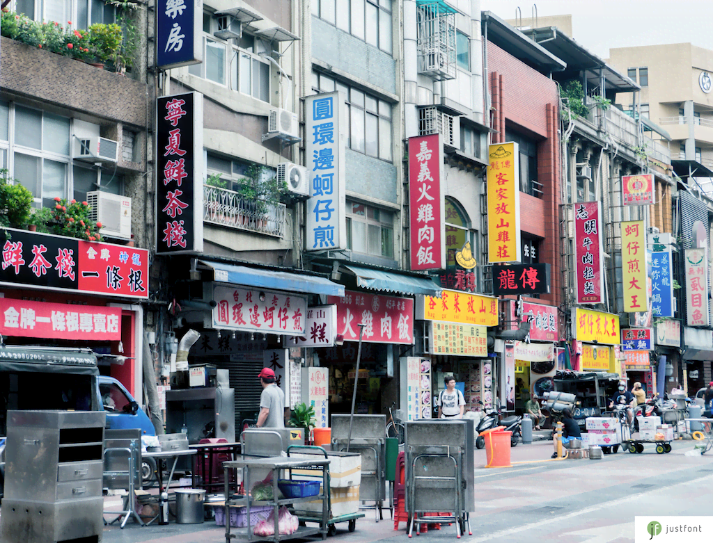
However, what caught Shen’s attention wasn’t this classic style, but rather a sign from a Tainan ice dessert shop.
The characters on this sign were notably different: square in proportion, low in contrast, with full strokes that showed clear signs of handcrafting. These characteristics immediately caught Shen’s attention.

From this starting point, Shen began collecting text samples from old storefront signs and book covers, venturing into traditional markets and temples to find these captivating period-specific design characteristics. To ensure comprehensive coverage for Kam-á-bi̍t’s development, she extensively studied historical signage, researched vintage books and advertising materials, and consulted online archives of historical publications.

Understanding the Mindset of Sign Painters
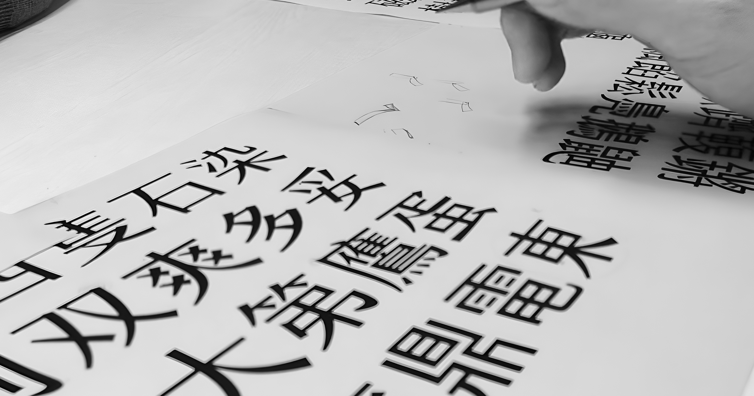
Rather than simply collecting character forms, which might lead to mere replication, Shen took a hands-on approach to better capture the essence of traditional aesthetics. She put herself in the position of a sign painter, drawing characters by hand and deliberately avoiding font design software.
At this stage, efficiency took a back seat to finding the right forms, including stroke shapes and character structures. While Kam-á-bi̍t leans towards Ming (Song) and Kai style, Shen practiced various other styles during her hand-drawing phase to understand the nuances of sign painting techniques.
,或者右上方接近黑體的造形(「森」、「始」)-scaled.jpg)
When drawing characters, Shen intentionally worked without templates, using only grid lines to define rough outer boundaries. Working directly in ink without preliminary sketches meant limited opportunities for adjustments, with only minor touch-ups possible at the corners.
.png)
To ensure proper spatial distribution when drawing, she had to deviate from typical writing stroke orders, instead starting with the outer frame. After establishing the outer contours and major component shapes, she would fill in the internal, finer strokes. This approach created character relationships that differ from conventional writing patterns.
,再完成下方的虫字(綠色部分),最後才繪製中間的必(黃色部份)。可以看出文字比例因為先後順序而影響可運用的空間。.png)
A Fresh Take on Traditional Type
The spatial distribution and stroke thickness variations, influenced by tools, medium, and purpose constraints, might be considered flaws from a contemporary digital type design perspective. However, Shen believes these elements embody the spirit of traditional hand-painted signs. The imperfections from hand-drawing create character and flavor.
However, after two months of pure hand drawing, Kam-á-bi̍t needed to transition into a usable digital typeface, requiring computer adjustments and expansion. Additionally, as team members would share the work of creating over 8,000 characters, standards needed to be established for better communication and integration.

Shen admits that despite her hand-drawing experience, her familiarity with digital typeface uniformity made it challenging to preserve the hand-drawn qualities during the digitization process.
For her, this represented a tension between immediate visual appeal and lasting appeal: immediate appeal pursues balance in black and white spaces and structure, while lasting appeal requires maintaining the “imperfections” that give the typeface its rustic quality. However, as Kam-á-bi̍t is primarily a display typeface rather than a text face requiring stable balance, there was more flexibility to lean into traditional lettering features.
Visual Compensation Choices
In digital type design, one key aspect of reading comfort is “grayscale balance.” Grayscale refers to the density of characters, which relates to stroke count, stroke thickness, and other factors. We don’t usually notice grayscale variations when reading because typeface designers use various methods to balance it.
One method is visual compensation of stroke thickness. Taking the character “酒” (wine) as an example, the two “legs” in the “酉” component show significant thickness differences between their upper portions and the strokes within the frame. This is a technique to prevent all strokes within the frame from blending together, creating more balanced white space through stroke weight variation.

However, when painting traditional signage by hand, even if strokes are segmented or different brush sizes are used, it’s impossible to scrutinize and adjust details at the level possible in digital type design. This limitation in fine adjustment might result in uneven visual distribution of black and white space across characters on the same sign.
If this visual unevenness is part of the handcrafted quality, perhaps Kam-á-bi̍t could preserve it.

The design team took this approach when creating Kam-á-bi̍t, deliberately avoiding the typical digital typeface approach to stroke weight distribution. Sometimes they even did the opposite, intentionally making the white space within characters more uneven to create an imperfect, rustic feel. While this might sacrifice character legibility and stability for some typefaces, Kam-á-bi̍t is primarily intended for display purposes at larger sizes, where compressed spaces remain clear and legible while maintaining their handcrafted flavor.
Modern Writing with a Vintage Feel
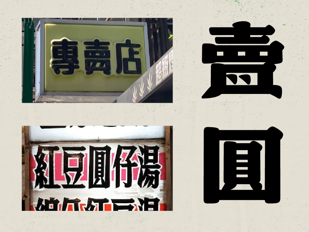
The typeface preserves traditional signage writing variants commonly seen in vintage signs. These variations might have originated from space and tool constraints. For example, the horizontal stroke in “貝” (within “賣”) becomes two dots, the inner “口” and “貝” in “圓” merge into one unit, and parallel “口” components in characters like “噪” and “觀” combine.
As a typeface inspired by lettering, Kam-á-bi̍t initially planned to incorporate these special writing variants. However, to avoid limiting its usage scope as a modern typeface, the design team decided to include current standard forms, implementing the variants through OpenType substitution technology.
But how to maintain the nostalgic feel with modern standard forms? Shen again emphasized the imperfections of hand-drawn characters while enhancing other stroke forms.
For example, let’s look at the character “賣” (sell). In modern standard writing, the “貝” component at the bottom contains two horizontal strokes. In typical digital typeface production, specific stroke thickness values would be set and overall proportions would be evenly distributed. However, for Kam-á-bi̍t, excessive regularization would lose the traditional flavor. Instead, Shen adjusted the overall proportions, enlarging the “貝” component’s share of space and compressing the “罒” component above it, while also changing the vertical strokes into two dots. This approach creates space for the horizontal strokes in “貝” while maintaining the modern standard form, achieving the uneven handcrafted feel through proportion adjustment.

Beyond adjusting proportions, Shen also tried to preserve distinctive shape characteristics that don’t affect recognition, giving modern standard forms a vintage flavor.
Take “噪” (noise) as an example. In calligraphy, the bottom “木” component typically includes a hook stroke, a feature also common in traditional lettering. However, modern printing typefaces often omit these hooks for a simpler, cleaner look. In Kam-á-bi̍t, even in the modern standard variants, the hook in “木” is preserved, creating a distinction from modern printing typefaces.

Supporting Contemporary Usage
Beyond balancing “imperfect” rustic qualities with digital tool standardization, or weighing how writing variants affect period-specific aesthetics, Kam-á-bi̍t has other features that make it suitable for modern contexts while preserving traditional flavor.
For instance, Kam-á-bi̍t supports the jf 7000 character set, meeting contemporary application needs while supporting Formosan languages (Taiwanese Hokkien, Taiwanese Hakka, Indigenous Languages). It also includes carefully designed Latin characters and numerals that consider both modern usage requirements and historical context.


The creation process of Kam-á-bi̍t involved many “counter-intuitive” steps, starting with extensive hand drawing before moving to computer work, then attempting to capture handcrafted qualities using digital tools while maintaining quality standards. All these careful considerations aimed to create a typeface that’s both innovative and traditional, and most importantly, practical for modern use!
This article is translated from 柑仔蜜的設計之道:在傳統手繪與當代數位的平衡挑戰 with the help of Claude.