This article is written based on my talk at ATypI 2026 Stanford— Bridging Scripts: Communicating the Aesthetic of Hanzi to Latin-based Audiences.
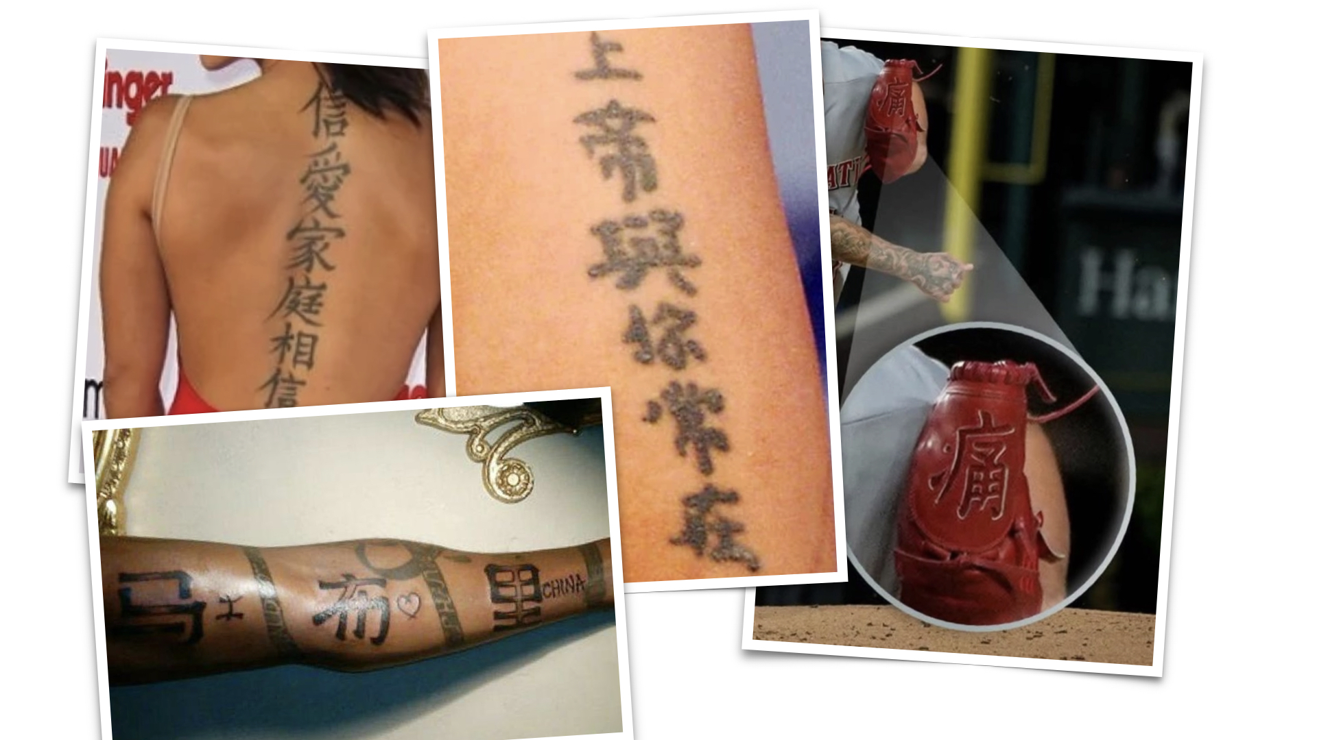
Hanzi is cool, and you want to have them tattooed on you or try incorporating them into your designs. I appreciate every attempt to challenge this complex writing system.
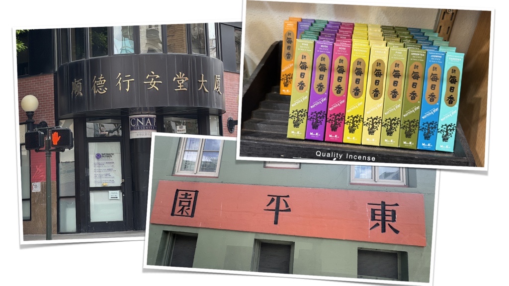
But when we, native Hanzi users, see your results, we often notice the same recurring issues: uneven colour, poorly assembled components, a misunderstanding of stroke shapes, and jumping alignment (not to mention the confusing phrases). These aren’t careless mistakes—they’re symptoms of a deeper misunderstanding about how Hanzi works.
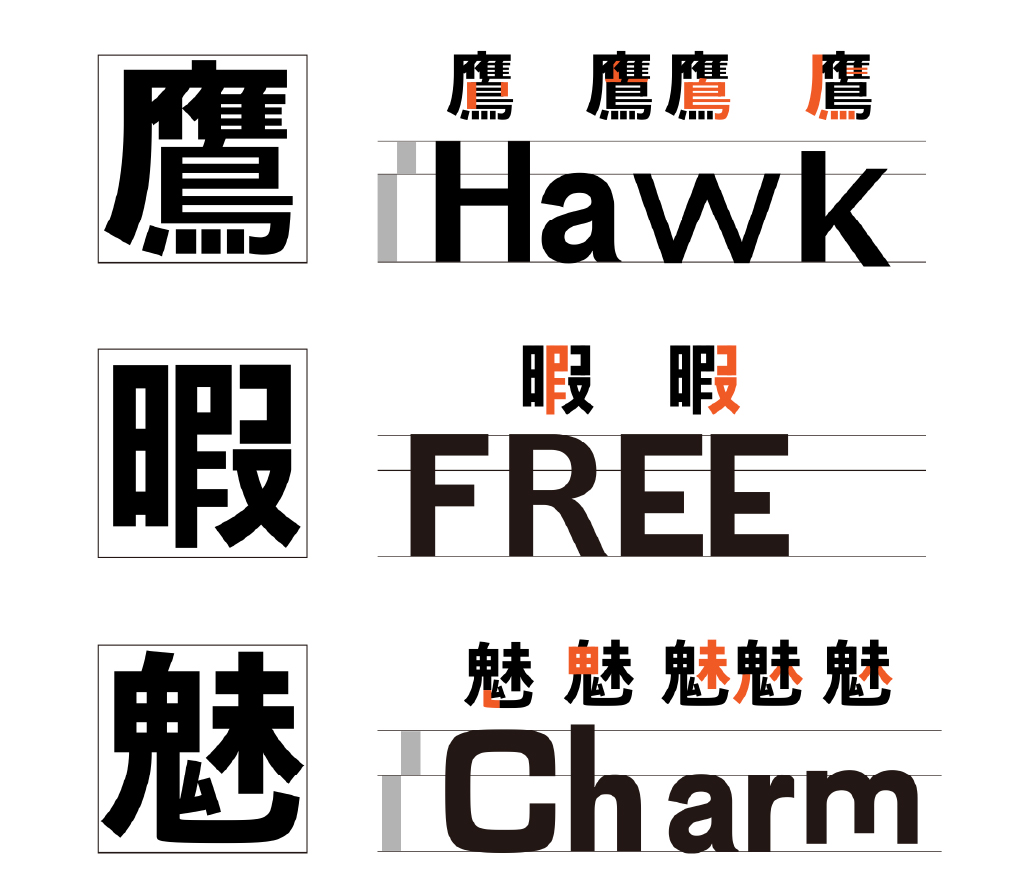
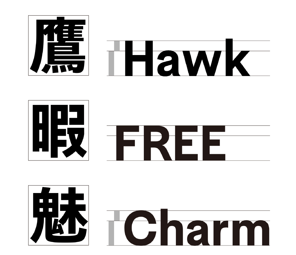
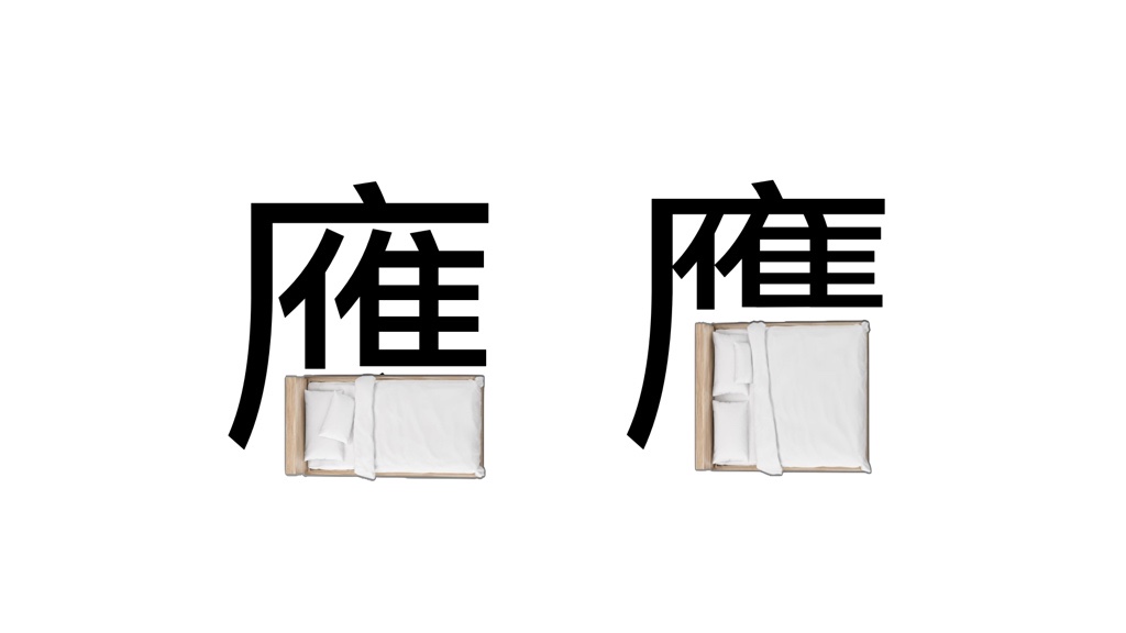
While designing Latin, like queuing, it’s all about the space in between; Hanzi, on the other hand, is like furnishing—the trick is to arrange everything within a limited space.
No Kerning in Hanzi! Hurray?
When designing Hanzi, we start by defining a box, which we call the type body (字身 zhì-shen). The idea of the type body comes from the physical edge of metal type.
There is then a second frame—the face area (字面 zhì-mièn)—which is the actual visual boundary of a character.
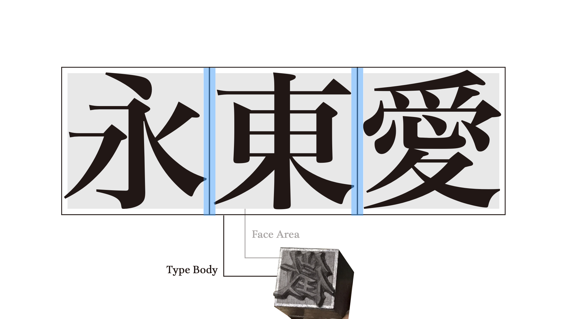
Since every Hanzi fits into these square blocks, the space between the type body and the face area is the natural side bearing, so in most cases, we don’t have to kern.
Sounds easy, right? “Hurray!” But the reality is that we have to spend all the time we saved on fine-tuning the space inside the boxes.
Furnishing Your Room: The Components
Hanzi is like Lego: we make components and assemble them.
There are some basic layouts: the inner-outers ⿴⿵⿶⿷⿸⿹⿺, the horizontals ⿰⿲, the verticals ⿱⿳, and the joined ⿻. If you’re familiar with Ideographic Description Character (IDC) systems, this shall not be new to you.
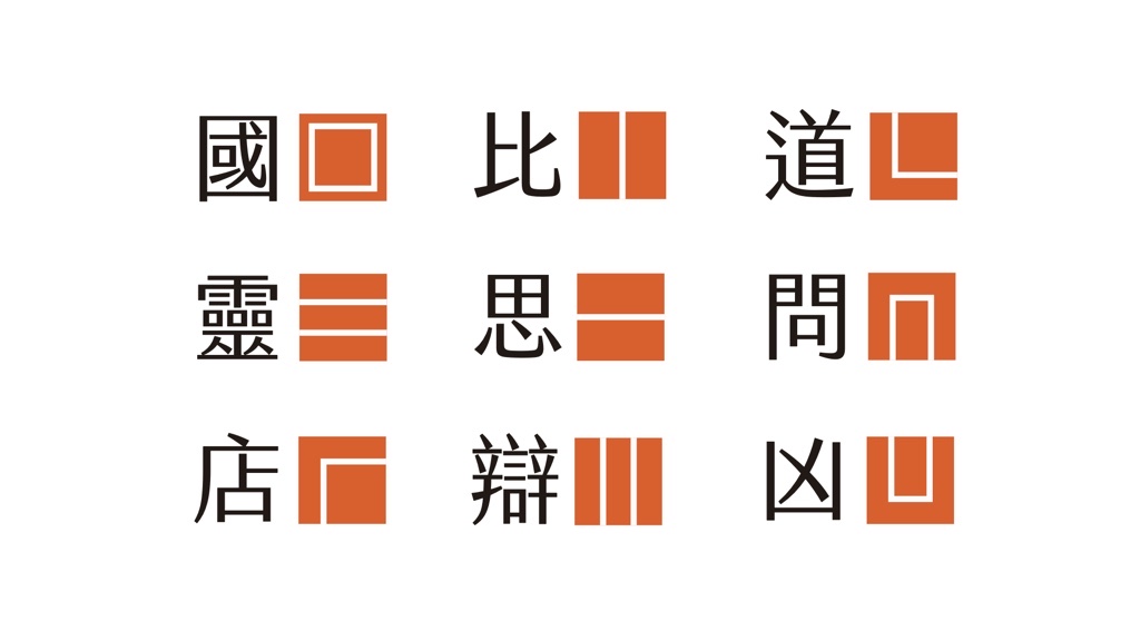
But the proportions change for each character, and every single one must be adjusted. Even for the same component, we need to adjust each one individually to assemble it with different radicals—the size changes, and the strokes need to be fine-tuned.
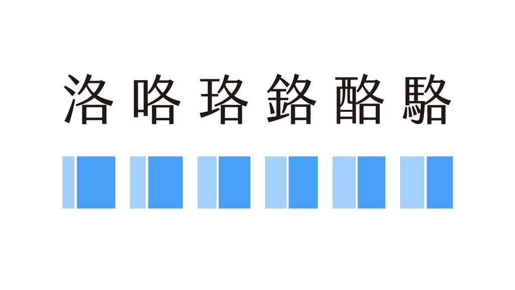
Sometimes, or I should say, most of the time, a character is made of multiple layers. The adjustment becomes even more complicated.
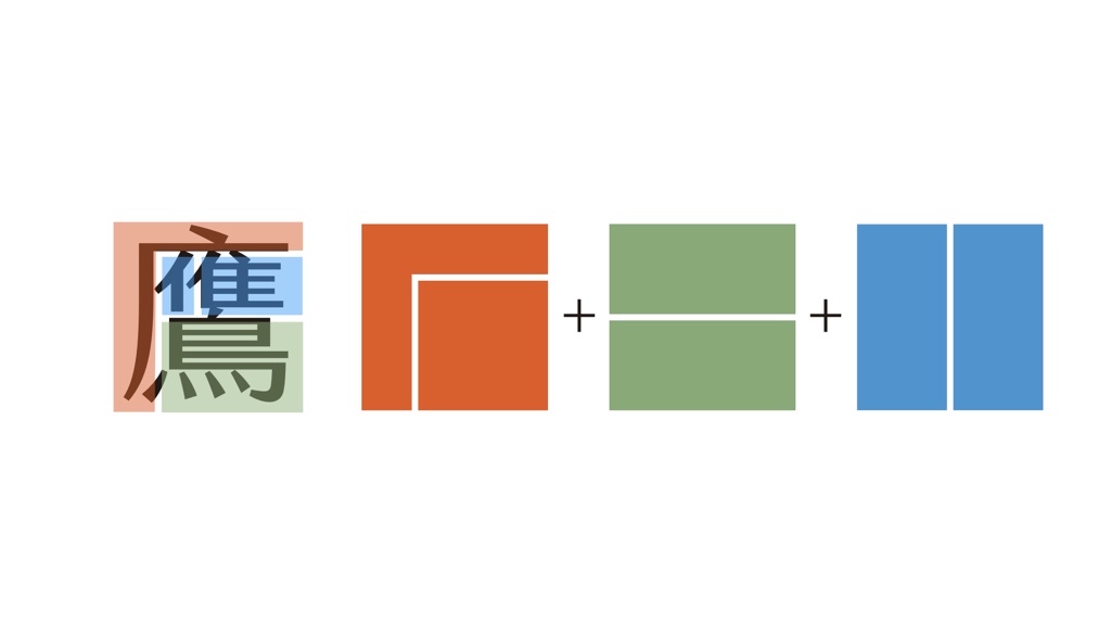
Since there are so many pieces of furniture needed to be put into a room, how do we know which one is a sofa, which one is a stool, and how to arrange the space between the sofa and the TV?
There are, in fact, fixed relationships and hierarchy between components. We break them down and observe how the parts relate to one another. Especially for the complicated ones.
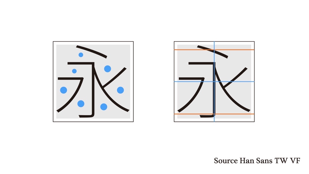
After understanding the relationship among components, the next concern is the spaces between each piece. You can start with observing an Extralight Heiti (eg, Noto Sans Serif), which is very close to the skeleton. Without the distraction of stroke weight, it’s much easier to see the relationship between stroke positions.
To compare with Latin: a Latin word builds horizontally by adding letters in a queue. A Hanzi character, however, builds inward by layering components within a fixed square space.
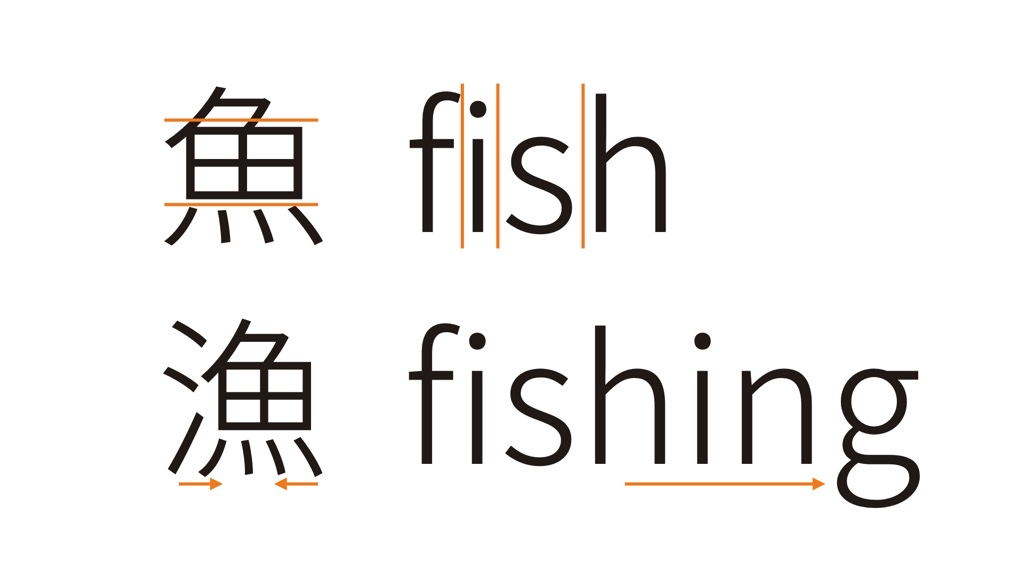
When you need to add more information in Latin, you simply extend the word horizontally—the queue gets longer. But in Hanzi, there’s nowhere to go outward. You can only compress internally: shrink the components, adjust the spacing, make it tighter.
Keeping Colour Even: The Challenge from 1 Stroke to 60 Strokes
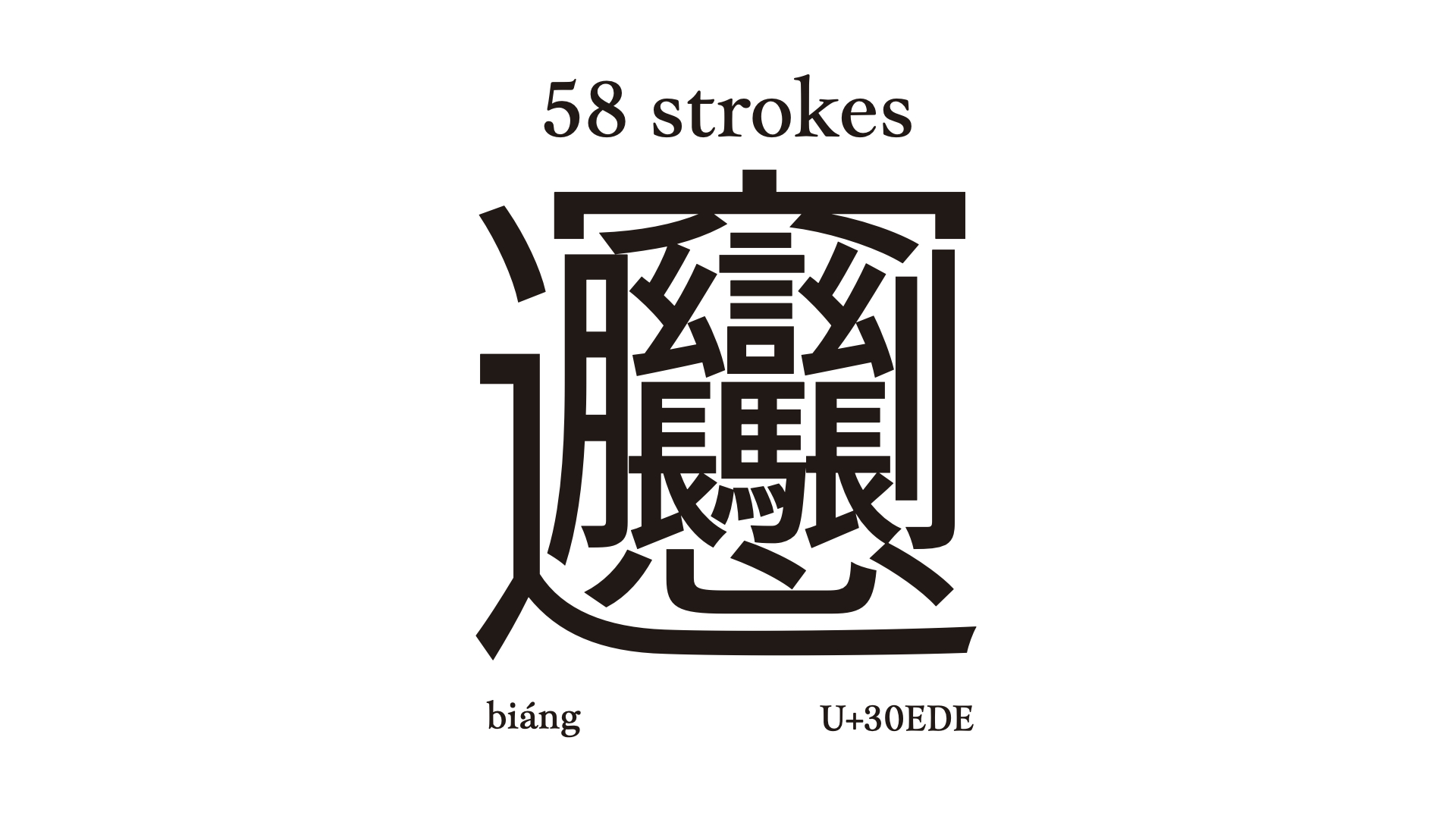
The character above is a real Hanzi character, referring to a speciality noodle of Shanxi, China. And it looks like a QR code even for native Hanzi users.
Though we rarely encounter characters like this, we do juggle with complicated Hanzi daily. Moreover, complicated characters (30 strokes on average) often appear alongside simpler ones (under 10 strokes) in common phrases or words. Therefore, keeping the colour even is important but difficult.
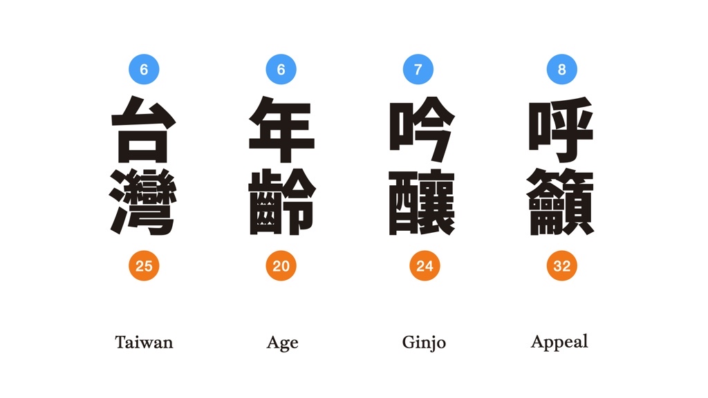
The straightforward idea to even the colour for different stroke counts is to reduce the thickness evenly.
Yet this simple approach doesn’t work. Uniform reduction makes characters look washed out when typeset. Instead, we need to adjust strokes selectively—some thicker, some thinner. This selective adjustment roots in the recognition of the primary strokes.
The Primary Strokes that Hold Weight, Shape, and Balance
The idea of primary stroke is similar to the “stem” in Latin typography—a key stroke that carries the structure and weight even when the letter gets compressed or adjusted. But unlike in Latin, where the thickness of the stem is relatively consistent, Hanzi strokes vary greatly according to density.

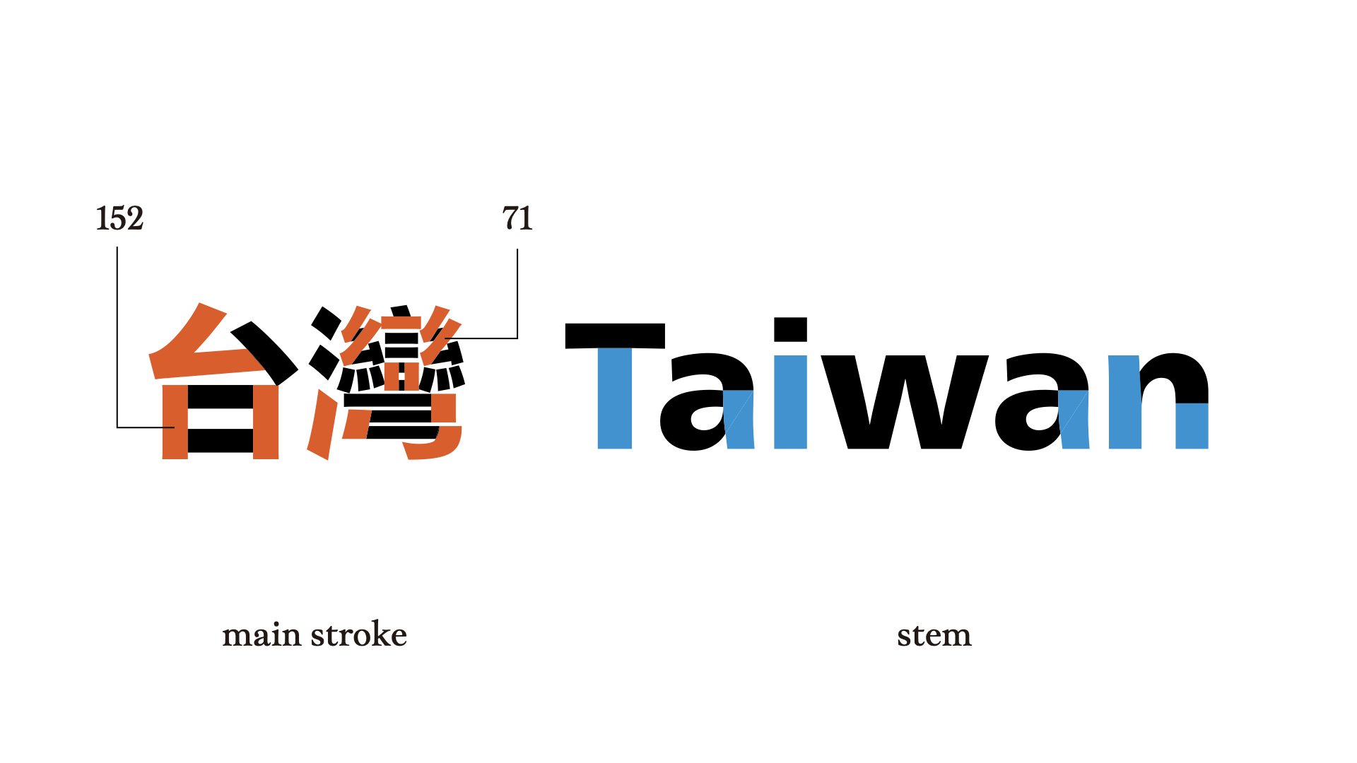
When a character has fewer strokes, the primary strokes are thicker. When a character has more strokes, the primary strokes are thinner, but not as much as the other strokes.
There are some basic principles.
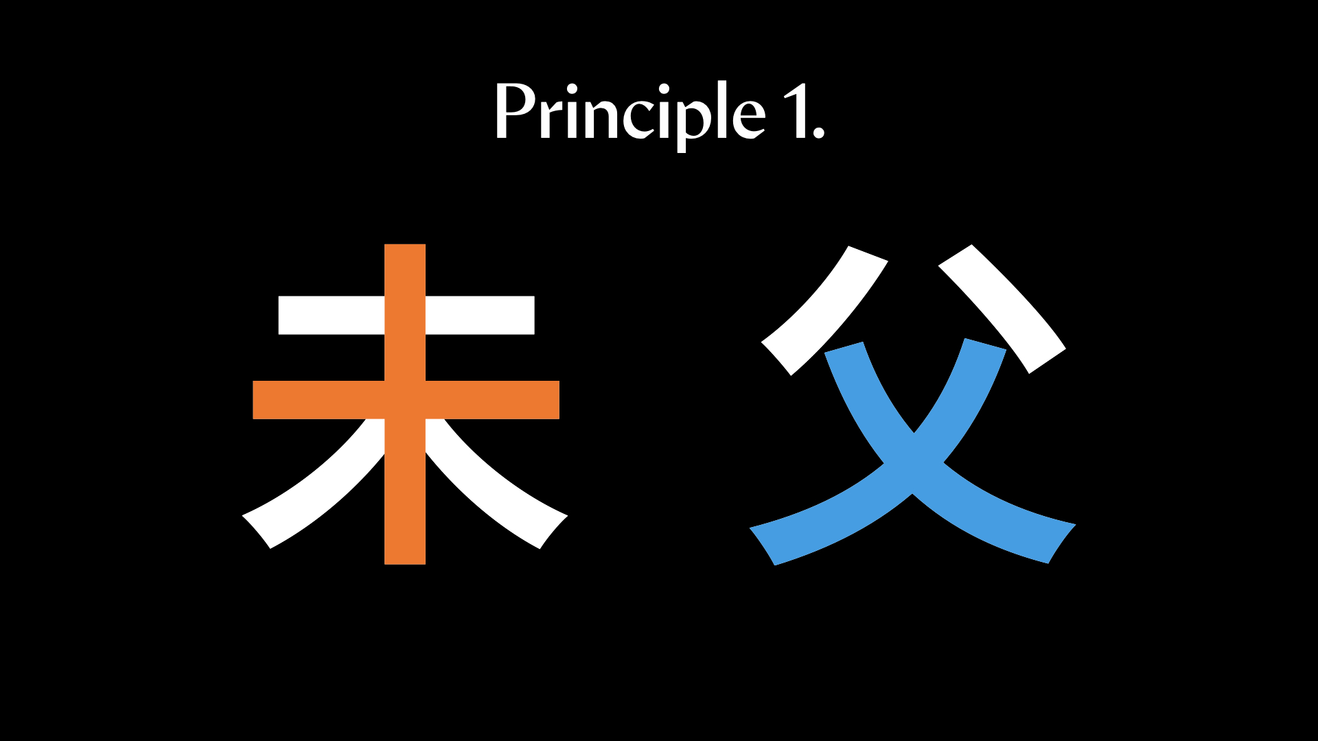
1. Longer Strokes Carry More Visual Weight
Usually, the longer strokes are the main strokes. They define the character’s structure and carry greater visual weight.
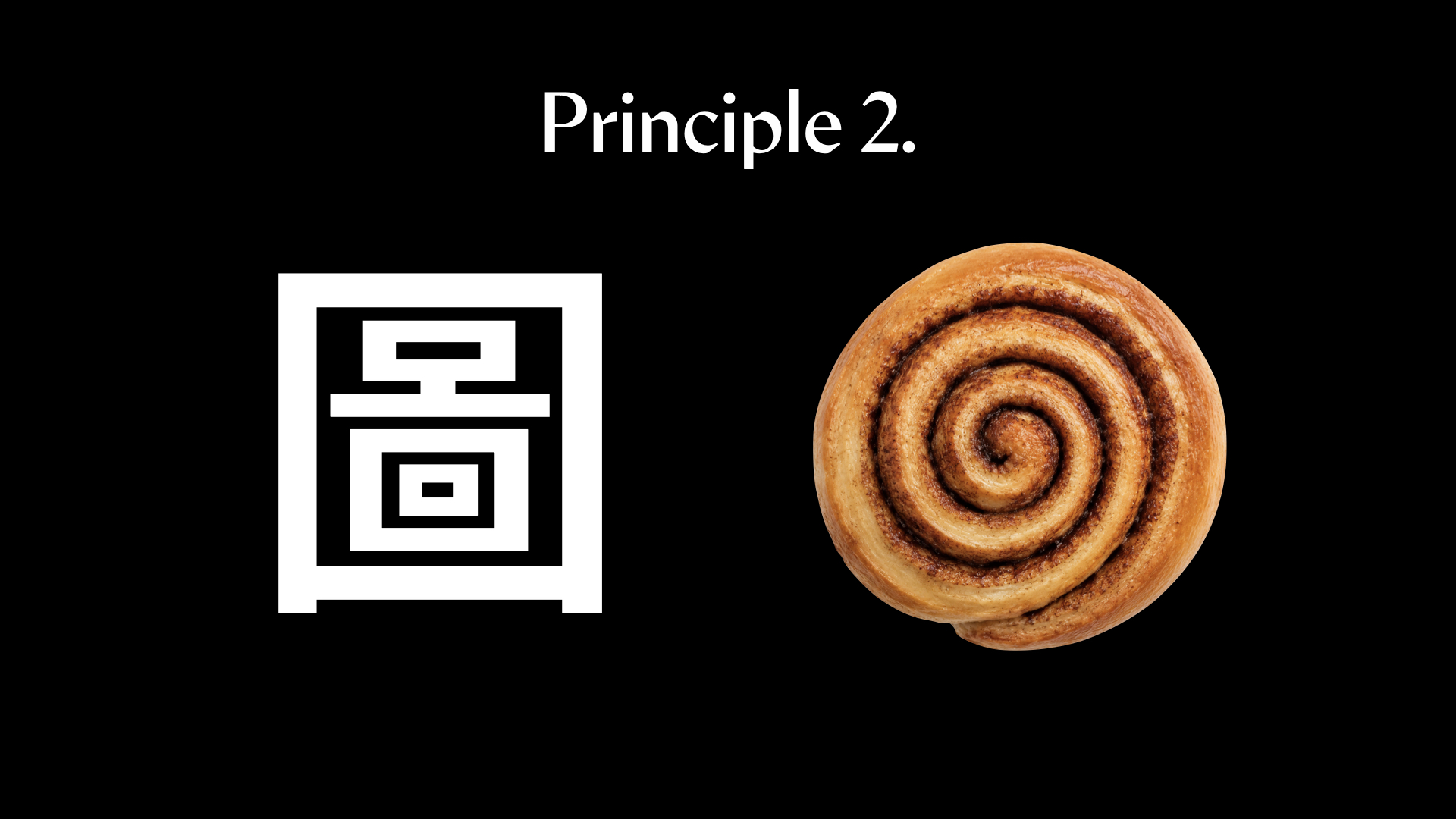
2. Outer Strokes Are Usually Heavier
Like a cinnamon roll, the outer ring helps hold the shape; the outer strokes are usually heavier in Hanzi design. Additionally, the lower parts of a character are heavier than the upper parts in many cases, though exceptions exist.
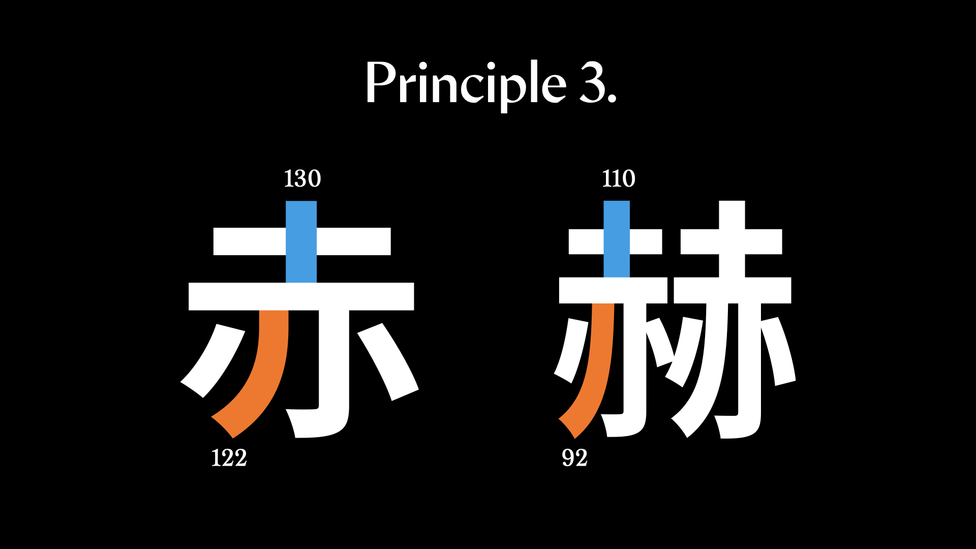
3. Balance the Density between Components
The balance between components needs to be taken into consideration as well. When a component holds more strokes, its main stroke can be less thick than its counterpart. When a component has much more open space, the main stroke stays thicker.
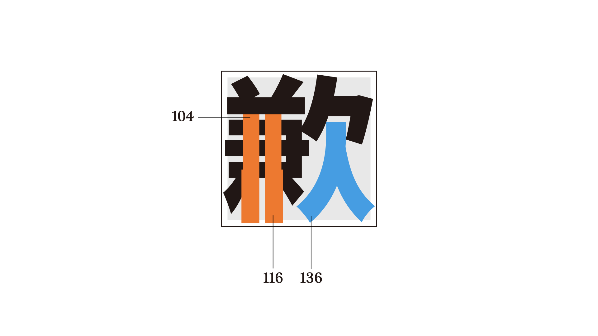
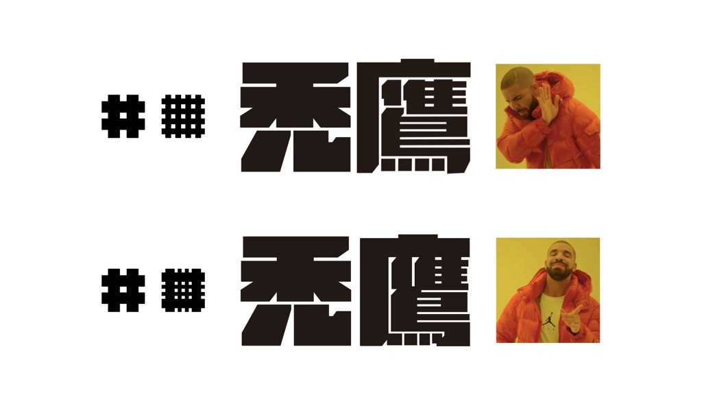
To conclude, stroke hierarchy is determined by three factors: structure, position, and density. Although the rule might change when adapting to different design styles, the first step is to become aware of the hierarchy of Hanzi strokes today.
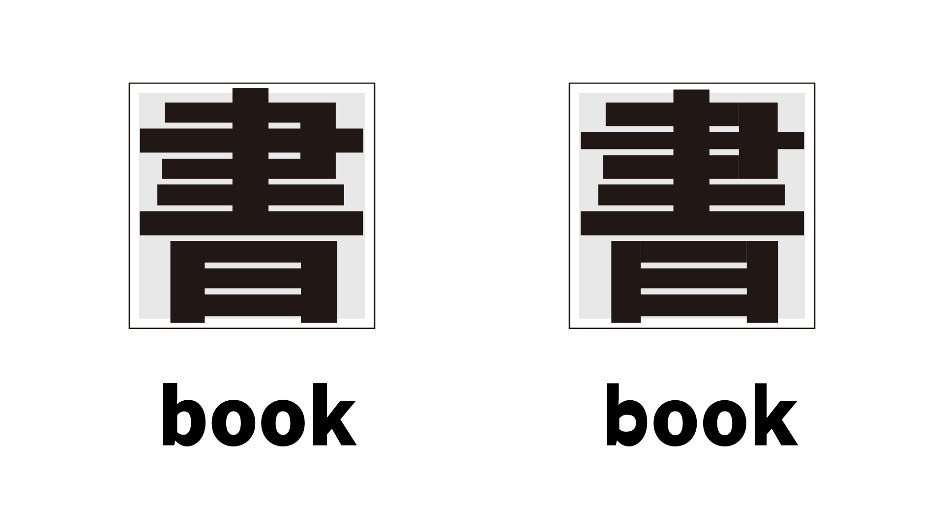
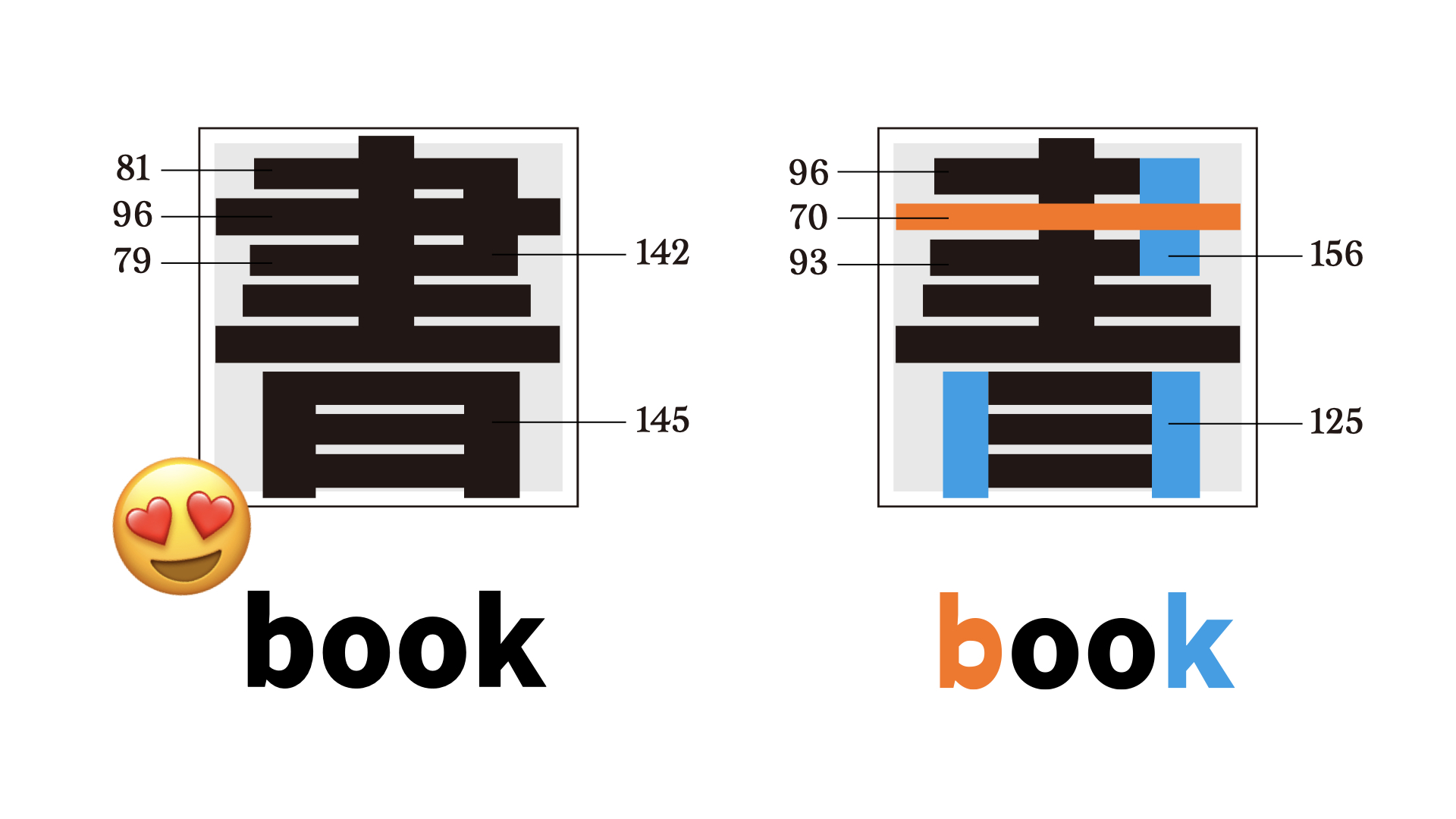
Try to examine the characters in the image below with the principle you’ve just learned. Now you should be able to tell the difference and how to improve. You can switch to read the details.
Stroke Shapes: The Legacy of Calligraphy
We’ve covered hierarchy and stroke weight. But where do these rules come from? The answer lies in calligraphy—the source of all Hanzi stroke shapes.
2D Writing and 3D Writing
In Latin calligraphy, taking the foundational hand as an example, you write from left to right with a broad-nib pen or a flat brush. You keep the same angle and even pressure throughout writing.
It is like working in a 2D space. The nib handles most of the shape-making for you; you simply follow the path, and the shape emerges naturally.
In Hanzi calligraphy, however, the writing direction goes from top-left to bottom-right, and the angle and pressure change constantly. It is like working in a 3D space. If you try to replicate it by tracing only the visible path, you’ll miss the 3D control—the result will be flat and lifeless.
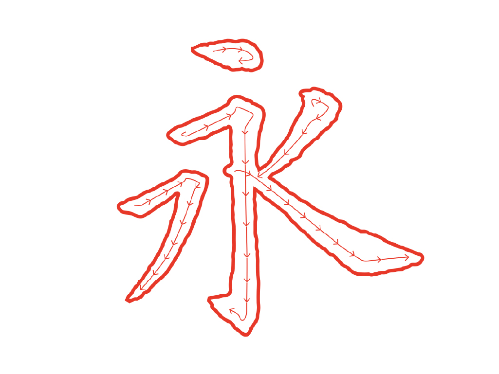
Moreover, unlike in Latin strokes, which can be built from separate segments, in Hanzi calligraphy, each stroke is a single breath—once the brush leaves the paper, that stroke is complete. The shape you see isn’t just the visible path, but the accumulated pressure and movement of one continuous action.
The Strokes Evolved from Calligraphy
You might have heard of the 8 Principles of Yong, referring to a single Hanzi that contains various commonly used strokes. The 8 Principles of Yong are considered the basics. Those who can master Yong can master Hanzi calligraphy. Yet there are far more than eight strokes in Hanzi. Even for dots, there are too many ways to write them.
Some principles of calligraphy remain relevant in print or modern styles.
Mingti, which evolved from Kaishu (the regular script), is usually paired with Latin serifs. But the decorative elements in Mingti are much more diverse.
The difference between the inner and outer curves indicates the tension when writing the hook (the lowest part of Yong). The way a horizontal stroke starts (its cutting angle) reflects how the brush initially entered that stroke—the writing method is embedded in the final shape. The notch at the turn, the rounded end of a dot (the top stroke), and the transition of brush pressure are all preserved.
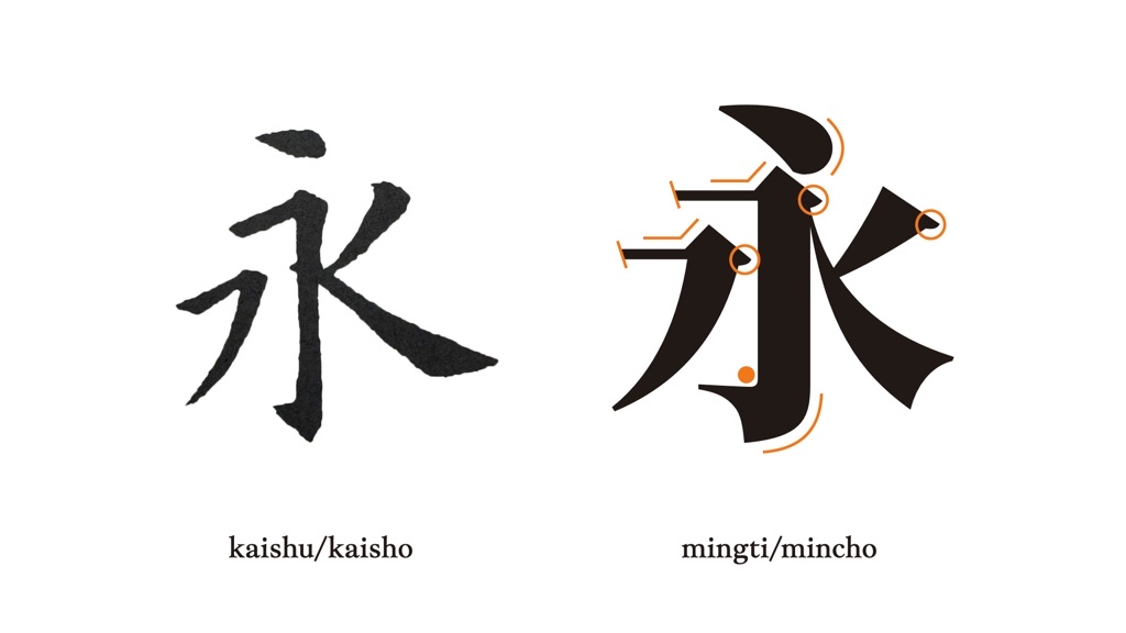
If Mingti seems too delicate to handle, why not try Heiti, the most widely used style on digital devices nowadays? Though non-native Hanzi users might consider it easier to pass, the Kaishu-based aesthetic remains.
The contrast caused by the brush pressure is less, but not gone. The hook must keep its tension. The shapes for different turning points vary. The ending of the left-falling diagonal stroke needs to echo the flare on the right.
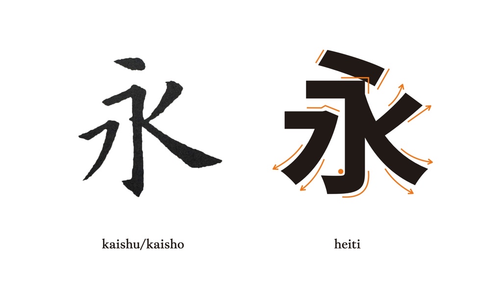
You might now think: “This means I must master calligraphy to design good Hanzi?” The answer is no. What matters is understanding where these shapes come from.
Misunderstanding the origin of stroke shapes may cause problems.
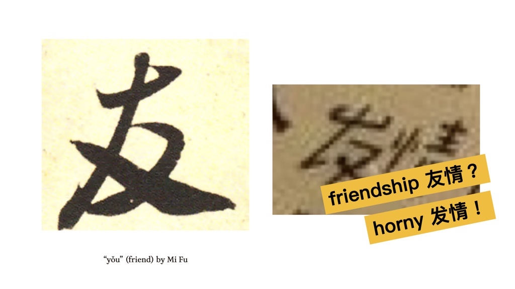
I recently saw a collection of Hanzi tattoos from Germany, and they puzzled me.
-or-horny(发情).049.jpg)
They were likely copying brush traces from casual handwriting or calligraphy. For non-natives, the details might seem decorative, yet they completely change the character.
Fitting Flow into Boxes: Metrics and Visual Compensation
Hanzi calligraphy thrives on flexibility. Each character breathes and responds to its neighbours, developing different shapes and sizes. But printing demands the opposite, with characters packed into identical square boxes, the type body and the face.
Square boxes should be easier to align. But when characters are simply put in line based on the face area, they’ll look uneven and bouncy. Even though they’re technically in the same box, your eye rebels. This is where visual compensation becomes essential. The trick is a shared knowledge in graphic and Latin design: find the outline shape of each character and adjust its position accordingly.
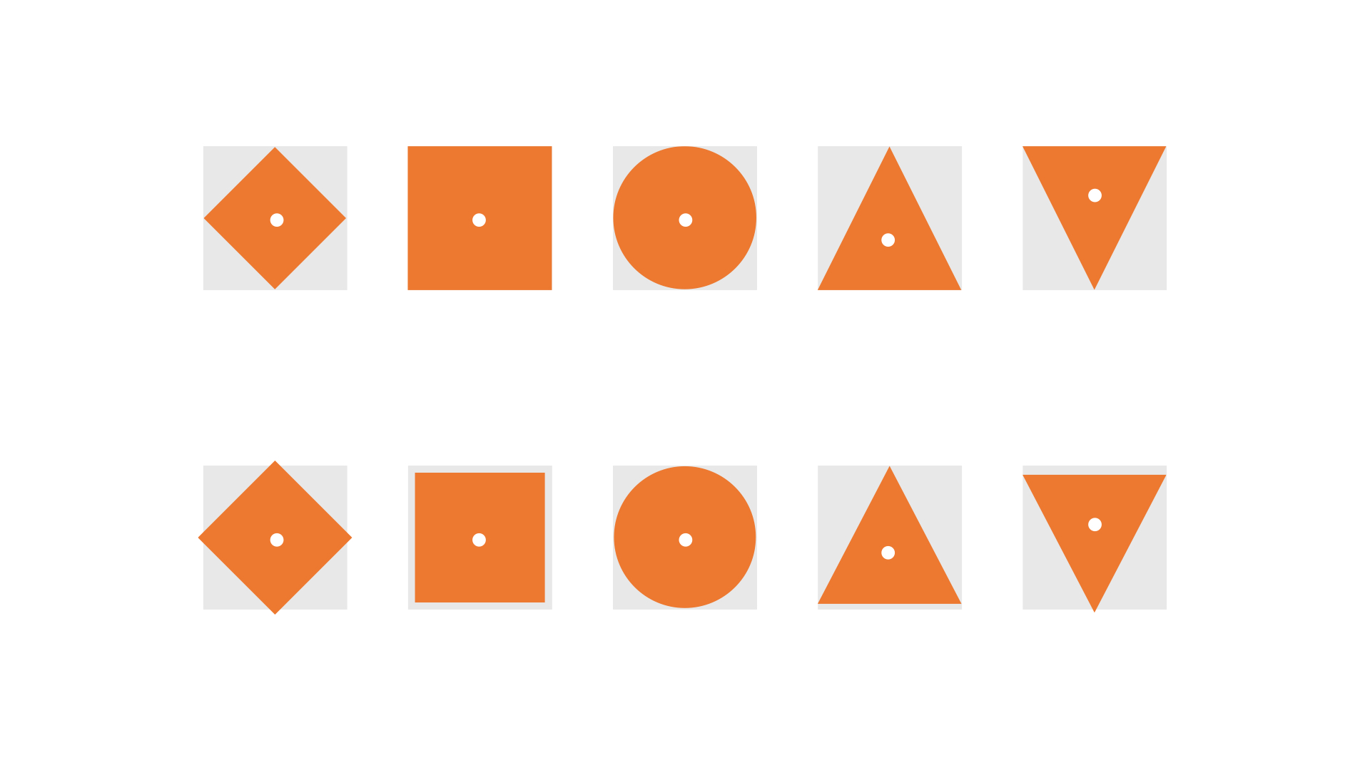
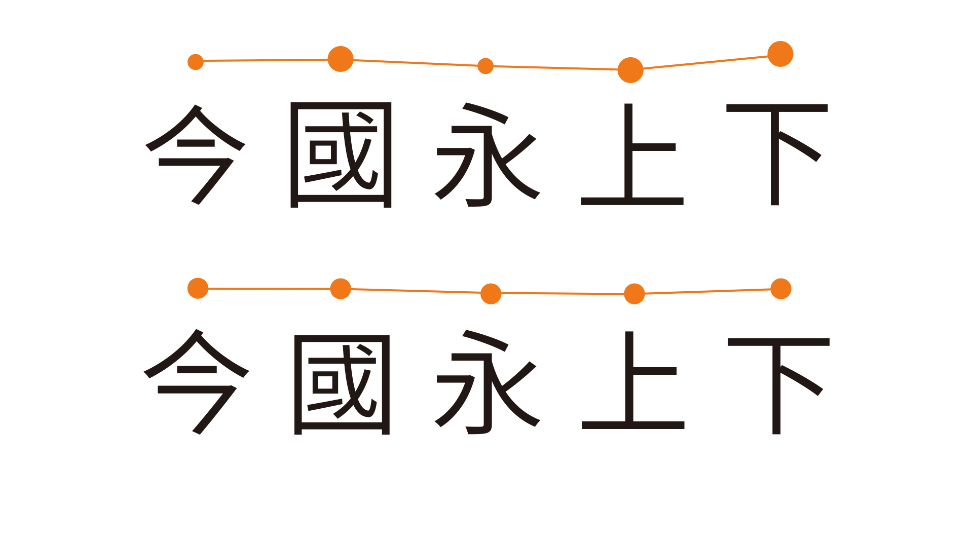
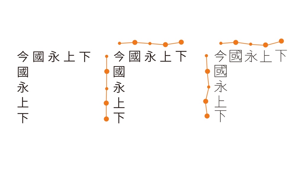
While box and outline play significant roles in Hanzi design, metrics within the box are just as important. Unlike Latin, which has very definite metrics such as x-height, ascender, and cap height, the guidelines for Hanzi vary from style to style.
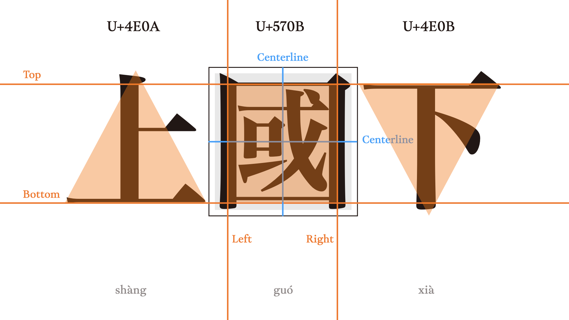
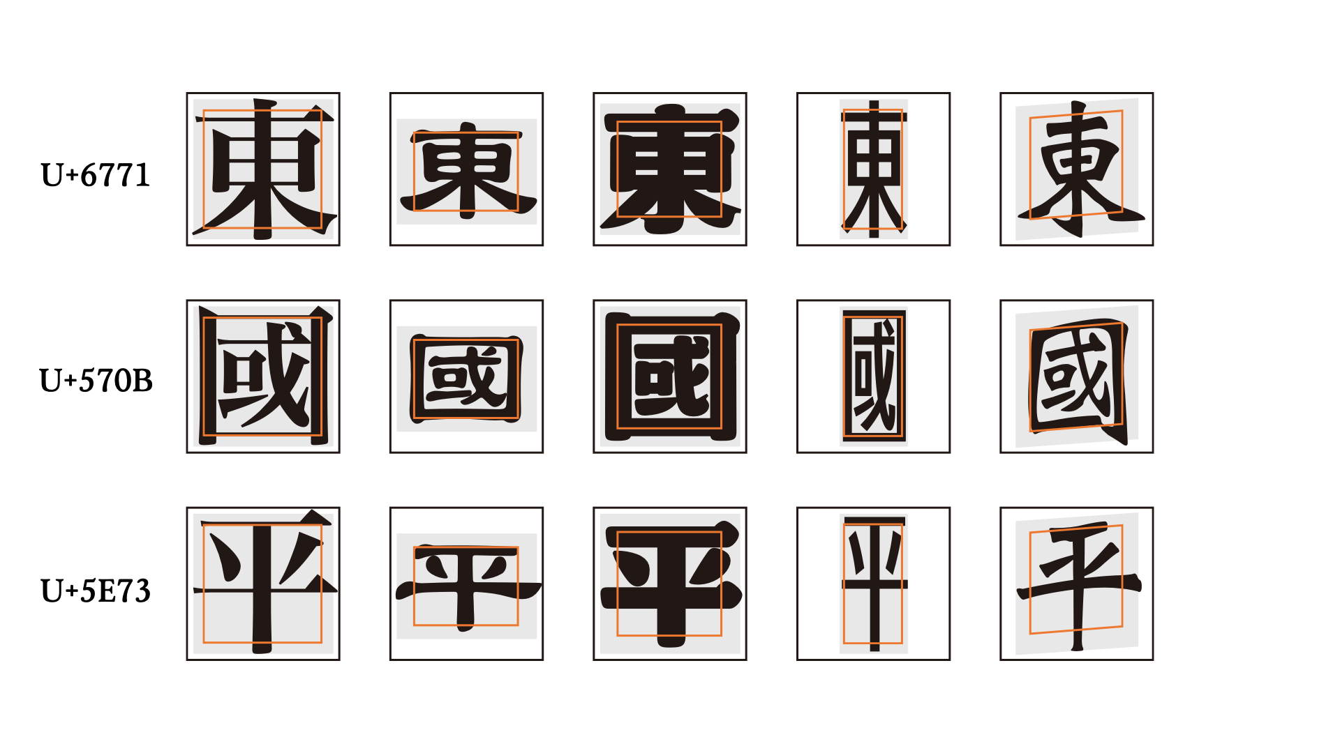
For different styles, the outline shape of Hanzi changes, and so do the guidelines. While the type body remains constant, designers define their own face ar according to the design style. The spacing between characters will differ depending on whether the design is loose or tight, high-gravity or low-gravity.
Finally, Typeset, Proofread, Redo or Reach Out
Guidelines are only guidelines. Rules can be changed. In the end, what you need most is to trust your eyes: typeset, proofread, and keep on adjusting.
Designing Hanzi is a long and challenging journey. Good luck!
If you’re designing with Hanzi, or if you’d like feedback on a design—including that tattoo you’re planning—feel free to contact me. I’m always happy to help.