How do Chinese Fonts come to life?
When it comes to Chinese fonts, there are a lot of common questions:
- Who design these fonts, why create thousands of characters?
- Do designers draw every Chinese character from scratch?
- How do they maintain consistency across each characters?
Even with rising interest in Chinese type design, finding clear answers about this information and resources—especially in English—remain surprisingly rare. The story of how Chinese fonts are made still become a mystery. Long ago, people didn’t think much about it, some even figuring computers spit them out. But the truth? These fonts are the work of skilled hands, crafted carefully over centuries.
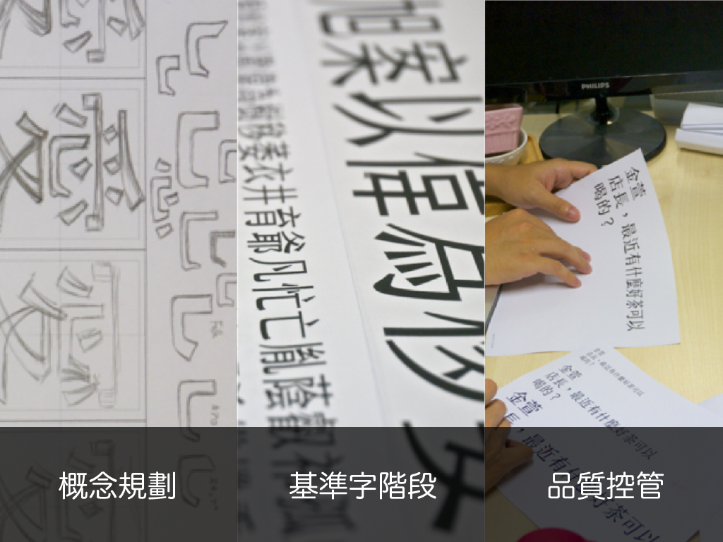
Making a Chinese font takes time—think at least two years to get it just right. Yet, we can snag that hard work in a quick download. In our documentary How Fonts Are Made, justfont’s type designer Rong and founder Michael Yeh pull back the curtain, sharing the grit and craft behind every Chinese font their team builds.
Getting Ready to Design a Chinese Font
Creating a font is like launching any product—it starts with solid market research. You need to figure out the font’s purpose, style, and where it fits in the market to see if there’s room for something new. Once you’ve nailed down its vibe, the real work kicks off. First up is picking the frame In Chinese typesetting, the font body (字身) is the space each character occupies, while the character face (字面) is the visible part. The frame (字框) helps with alignment, ensuring balance and consistency.: will it be tall, square, or wide? This choice sets the font’s shape and steers its overall look. Next comes the skeleton Think of the skeleton as the font’s backbone—much like a human’s—it molds the visual style and proportions of the characters., which decides how the font feels. A skeleton’s design drives the font’s “functionality”—making it “easy to read” and “easy to spot.”
Building a Character Set
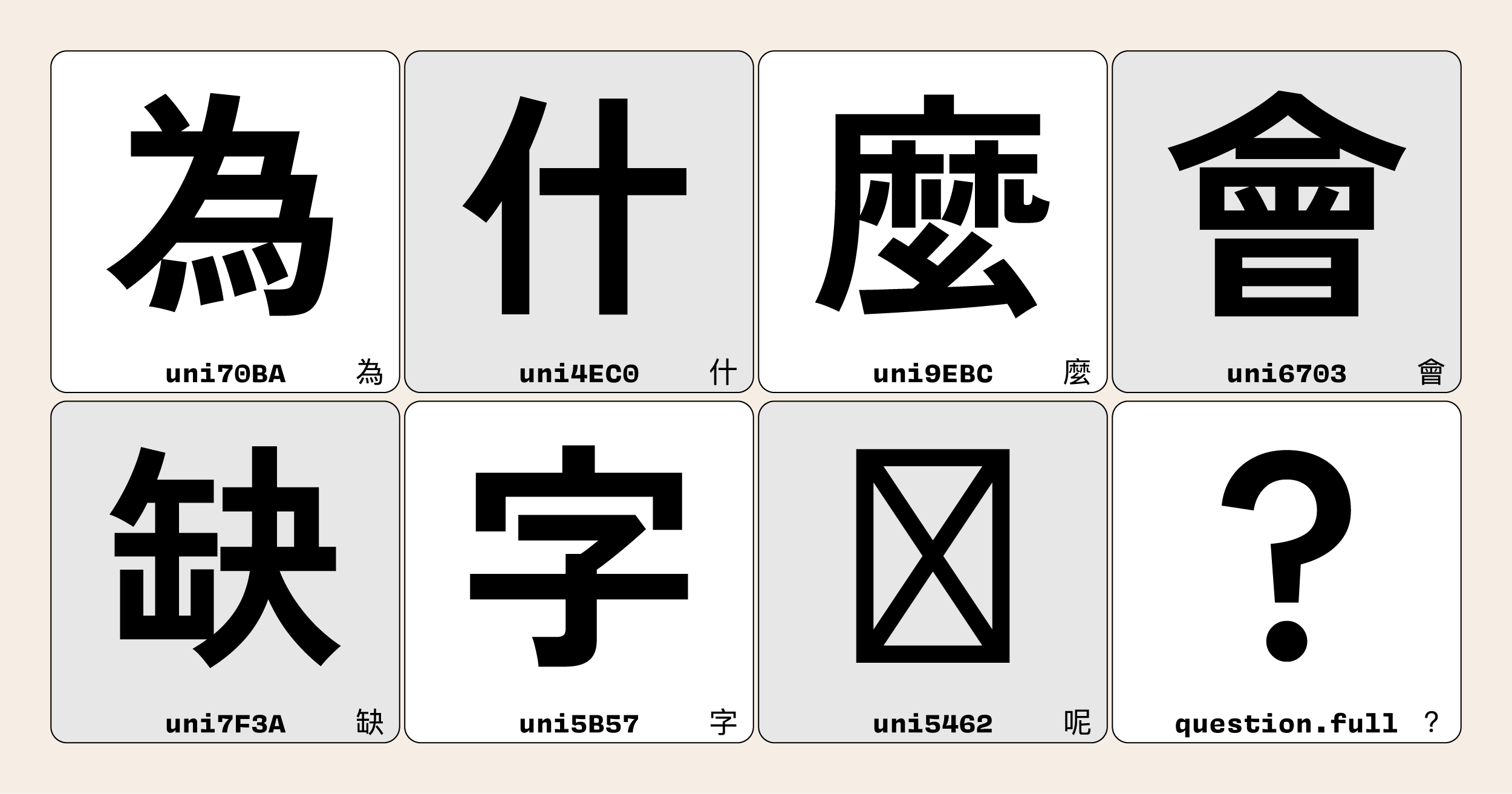
Chinese characters, numbering in the tens of thousands, would be a daunting task to design each one individually—would take forever. Despite the large number of characters, most of the characters can be broken down into smaller building blocks called radicals. By designing a core set of radicals The radical components can be copied and reused to expand into other characters, but each character still requires fine-tuning to ensure consistency and balance., these pieces can be mixed and matched to form a vast array of characters. This is where “basic characters” come in—they’re the starting point, setting the stage for everything that follows.
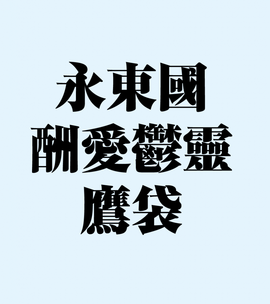
In the initial phase of font design, we kick things off with a handful of basic characters—typically 10 to 12. This is the experimental sandbox: we play with stroke shapes, tweak their frameworks, and test how they fit together. A big focus here is figuring out how to space the strokes just right, adjusting until the design feels balanced and cohesive. Not every character works as a foundation. Designers often begin with characters like “今, 三, 力, 永, 東, 國, 酬, 愛, 鬱, 靈, 鷹, 袋”. These aren’t random picks—they push the boundaries of what’s common in Chinese writing, in both subtle and obvious ways. Take “東”: it’s the widest from side to side, helping us pin down the font’s maximum width. Then there’s “鷹”, packed with horizontal strokes, which guides us in keeping complex lines neither too thin nor too condensed.
Radicals can be reused across characters, but it’s not a simple copy-paste job. Each new combination needs tweaking to maintain a uniform look and feel. Still, with so many characters out there, these initial ones don’t cover everything—especially not the “ideographic” or “phono-semantic” types that blend multiple radicals and dominate the language. To tackle this, we expand the set, usually to around 300 characters, to include the radicals needed for the 10,000 most-used characters.
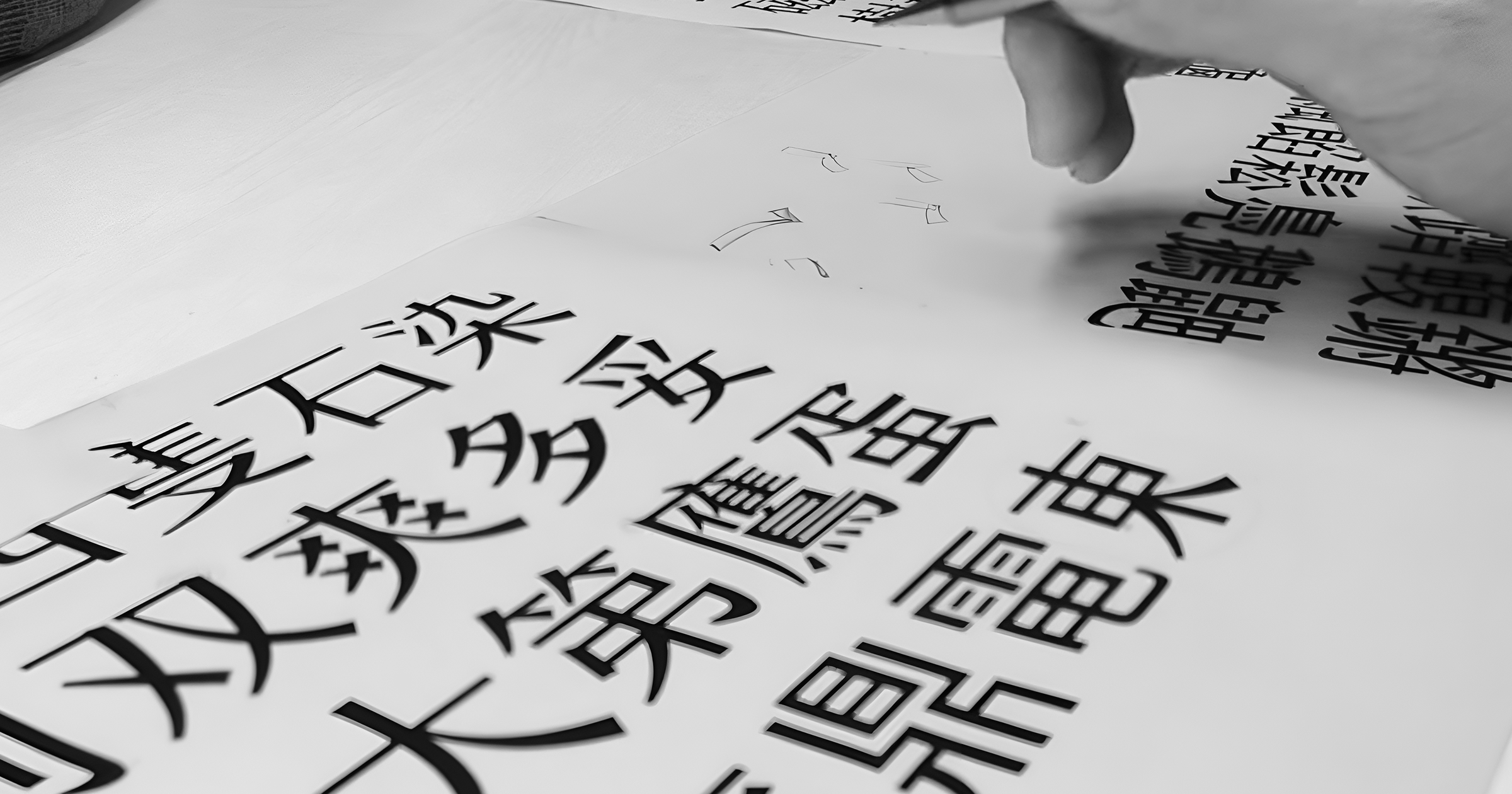
Even in the digital era, where components can be duplicated with a click, font-making isn’t a push-button process. Every Chinese character is like a tiny picture, and borrowed radicals often demand heavy reworking to fit their new home. It’s a hands-on craft—each character gets polished by human eyes and hands to ensure it sits just right.

Maintaining Consistency
Crafting tens of thousands of characters is rarely a solo mission; it’s a team effort. That brings its own hurdle: everyone sees beauty differently. One designer might love soft, flowing curves, while another prefers crisp, bold edges. Neither is wrong, but a font demands consistency. To keep things on track, the team gathers often, reviewing each other’s work and smoothing out any quirks that clash.
Mistakes happen, just like in handwriting, and fresh eyes are key to catching them. Ever stare at a word so long it stops making sense? That’s a real thing in font design too. After hours hunched over screens, designers can miss flaws. A character might shine at full size but falter when shrunk down. To catch this, we print samples in different sizes and pass them around for feedback. It’s not rare for a single character to get reworked five times—or more. A top-notch font emerges from countless rounds of tinkering.

The Duty Behind the Design
As designer Rong put it in a documentary, font creation comes with a deep sense of “responsibility.” Once a typeface hits the world, it’s everywhere—on signs, in ads, woven into daily life. A great font fades into the background, doing its job so smoothly no one notices. But a sloppy one? It’s visual noise, dragging down a stunning photo or a well-planned space.
For type designers, this weight never lifts. Even if most people don’t spot the flaws, the work isn’t done until the designer conquers every challenge they see. It’s more than just drawing letters—it’s about shaping how people connect with words and, in a small but real way, influencing the world around them.
This article is translated and rewritten from 字型下載之前,先看看字型是怎麼製作的.