Life is a maze of pairing challenges, and the tough part is that it’s less like ticking a box on a multiple-choice quiz and more like tackling an open-ended essay—definitive answers are hard to come by. When things aren’t simply yes or no, it can get daunting! However, this article offers some helpful patterns to guide you through the complexities of pairing Chinese and Latin fonts.
Pairing: It’s All About Thinking It Through
Pairing is essential, whether you’re matching clothes, planning a meal, or picking fonts. It’s less about rules and more about what feels right. Picture this: a pizza topped with tapioca pearls—yep, you heard that right!
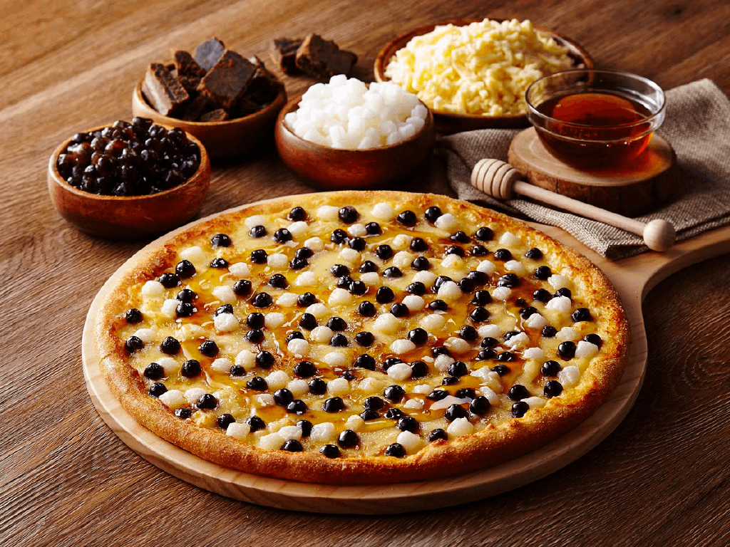
If you saw a pizza like this: would you be okay with that? Or would it feel totally weird? Even after tasting it, would you still say, “No way”? Pairing is all about trying things out. At first, tapioca on pizza might sound wild—like it’s breaking all the rules. But then you taste it and think, “Wait, this is good? What just happened?”
That’s the thing with pairing—there’s no one “correct” answer. It depends on what you like. Sometimes the weirdest combos turn out amazing, while other times something odd might actually work for a reason.
Similar Looks, Perfect Match: Harmony
Chinese and Latin scripts are like strangers from different planets—two totally different writing systems that don’t naturally fit together. But thanks to history and today’s design needs, pairing Chinese and Latin fonts is something we deal with all the time.
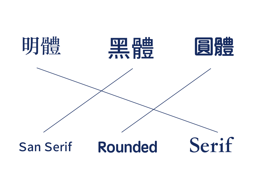
The classic way to do this is to match fonts that look alike. It’s a no-brainer that works: MingTi (明體) go great with serif fonts, HeiTi (黑體) vibe with sans-serif ones, and YuanTi (圓體) pair nicely with rounded styles. This method is simple and almost always a safe bet. But if you’re feeling bold and want to mix things up, there are fancier tricks to try. * It should be noted that due to the historical context and design differences between Chinese characters and Latin scripts, MingTi (明體) cannot be referred to as a “serif”, and HeiTi (黑體) should not be called a “sans-serif”.
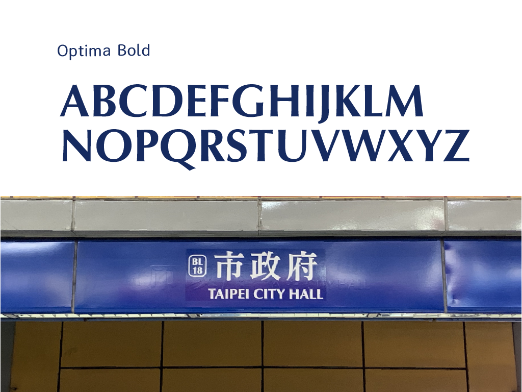
But, who says MingTi (明體) can’t team up with sans-serif fonts? Check out the Taipei Metro station signs—they’re a perfect example. They use a custom bold MingTi (明體) alongside the Latin font Optima, and it looks smooth without feeling clichéd.
Optima’s “Roman proportions” give it a classy, old-school feel that clicks with MingTi (明體) in a surprising way. They don’t look exactly the same, but that’s the point—this subtle twist skips stiff matching and gives Taipei’s signs a fresh, standout style. * The harmonious method isn’t about matching every detail. It’s about playing with ideas—like thickness, a classic vibe, or a cute touch—to find fresh combinations. Sometimes it works, sometimes it doesn’t, and that’s what makes it fun.
Red Flower, Green Leaves: Complementary
Not every font are naturally compatible. If you only chase harmony, you might miss the full picture. Take Chinese calligraphy, for example—they’re tricky to match with Latin fonts. In Taiwan, calligraphy often pops up in titles, logos, and branding to show off cultural roots. But what happens when you need to mix in some international flair?
One idea is to borrow from Western styles. Back in 18th-century Britain, the fancy copperplate script—with its graceful, swooping lines—became a hit among the upper class. You’d think its flow would pair perfectly with Chinese calligraphy, right? Not so fast—it’s not always that simple. Let’s break it down.
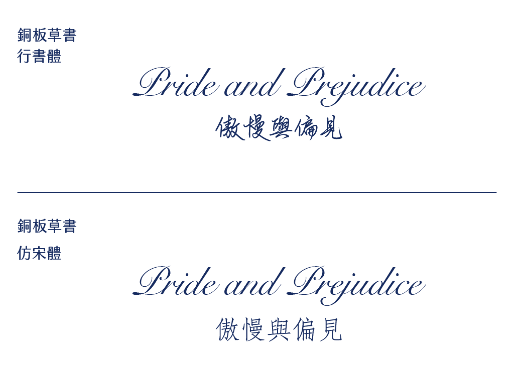
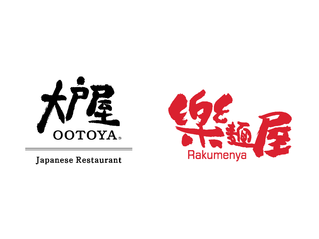
Imagine this: at first, you’ve got both the English and Chinese titles in Cursive Script (行書體). It’s eye-catching, sure, but when both scream for attention, nothing stands out. Instead, many designers go for a complementary vibe—one font leads, the other backs it up. For example, teaming a copperplate script with a FangSong (仿宋體) can strike that sweet spot. Brands like Ootoya and Ramen Kagetsu Arashi do this well: big, bold Chinese characters steal the show to flaunt their identity, while smaller English text plays a quiet, supporting role.
Echoes of a Time: Unique Pairings
When one person tries something quirky, it’s just a one-off. When everyone jumps in, it turns into a signature style. Hong Kong is the perfect example—its one-of-a-kind history has brewed a special way of mixing Chinese and Latin fonts.
Think of Hong Kong, and you probably picture bold, calligraphic signs—especially the famous and iconic Beiwei Kaishu Beiwei Kaishu is a unique Chinese calligraphy style that combines the structured elegance of Kaishu with bold, dynamic traits inspired by Northern Wei Dynasty inscriptions. Originally carved into stone to record history, it evolved into a brush form, becoming a key part of Hong Kong’s visual culture.. But the Latin text next to it? It’s not fancy or old-school serif. Instead, Hong Kong pairs those lively Chinese characters with punchy, condensed grotesque sans-serif fonts. The result is practical yet bursting with personality.
This combo doesn’t slot neatly into the “harmonious” or “complementary” boxes. Still, it taps into Hong Kong’s visual vibe, instantly bringing the city to life.
Take Tu Design Office, who designed the logo for Hing Kee Restaurant. He mixed a standard character with Beiwei Kaishu flair and teamed it with Helvetica Condensed. It’s not just a pretty choice—it’s a nod to Hong Kong’s gritty, nostalgic street charm.

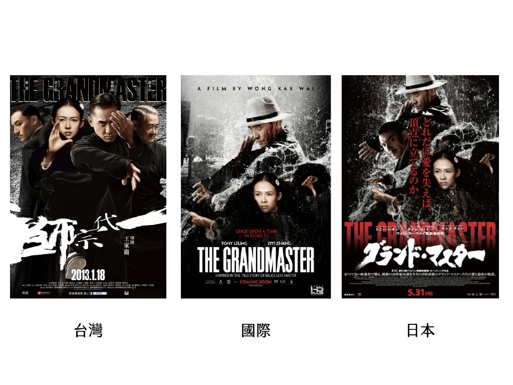
This pairing trick isn’t just for signs or transit—it shines in movies too. Look at The Grandmaster: its Taiwanese, international, and Japanese posters all use a slim Grotesque font for the English title. In the Taiwanese and Japanese cuts, the Chinese gets a calligraphic twist. Pairing those bold, flowing strokes with the sharp, slender Owen typeface breaks from the usual harmony or complementary rules. Instead, it mirrors Hong Kong’s loud, lively streets, full of grit and energy.
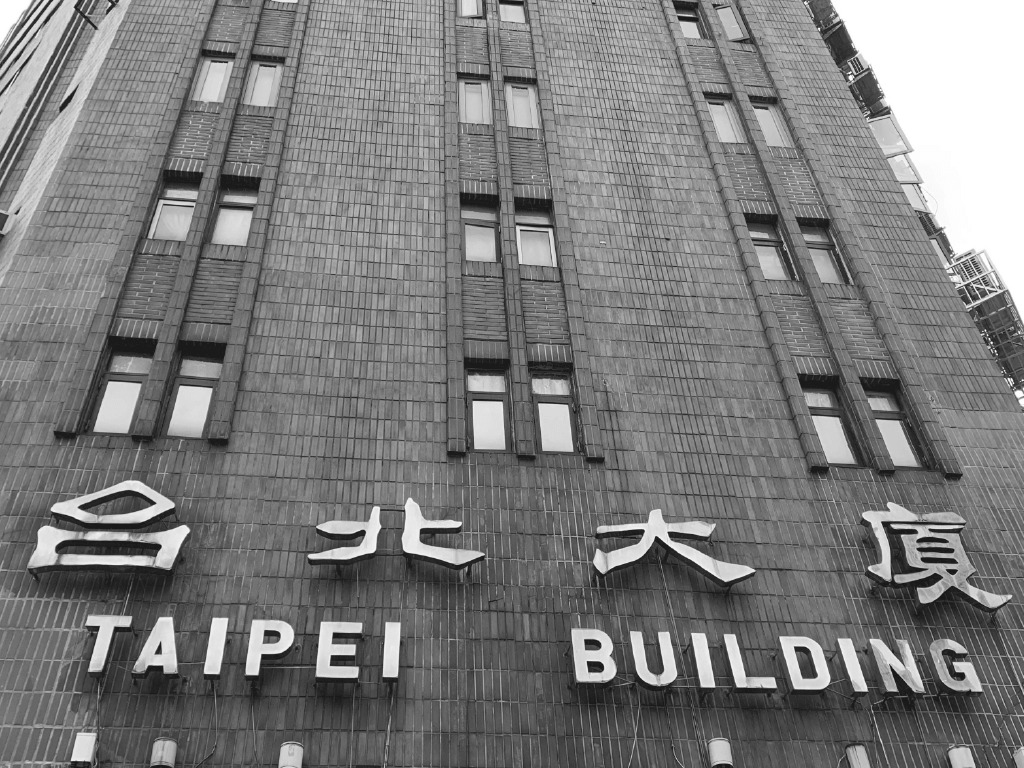
In Taipei, this mix of calligraphy and slim Latin Grotesque fonts defines the city’s look, especially in buzzing spots like Songjiang Nanjing, Zhongxiao Fuxing. It weaves together calligraphy’s rich past with the clean, modern edge of Grotesque styles. The result? A fresh vibe that captures Taipei’s blend of old and new, reflecting a city that’s alive with tradition and progress.
Surprising Yet Sensible
Pairing Chinese and Latin fonts has its trusty go-tos, like the harmonious and complementary methods we’ve covered. These are solid, dependable ways to keep things looking sharp and cohesive. But for designers itching to shake things up, there’s space to play with wilder, less obvious combos that still make sense. You know the saying: “The unexpected can still be reasonable.” These daring mashups can spark a whole new visual vibe—breaking the mold with a twist that’s fresh yet balanced. It’s this fearless leap into the unknown that often births the most exciting, standout typography, turning heads and inspiring new possibilities.
This article is translated and rewrote from 搭配的三個建議:中文怎麼搭英文?.