For designers and typography enthusiasts beyond Chinese-speaking areas, exploring Chinese typography can feel like cracking a captivating yet complex code, intriguing but challenging, especially with the limited availability of English-friendly resources. Unlike Latin alphabets, Chinese characters draw from a rich history spanning centuries, shaped by unique structural guidelines and detailed design principles that might seem daunting at first glance. No worries, this guide is your friendly starting point, offering a clear and approachable entry into Chinese typography, breaking down the must-know basics, and tackling the questions that come up most often.
- The basic ideas of Chinese characters
- An overview of Character sets
- Timeframe of crafting a Chinese font
- Pricing details and options where to buy Chinese font
- And, the production cost of Chinese font
Decoding Chinese Characters
For those new to Chinese, it’s key to grasp that Chinese characters, known as Hanzi Hanzi form one of the world’s oldest writing systems still in use today. Unlike Roman alphabets, primarily represent sounds, Chinese characters convey meaning directly. This focus on meaning over phonetics explains why learning Chinese relies heavily on memorization, with a vast repertoire exceeding 100,000 unique characters., are considered logographs, unique symbols representing objects or ideas. Each character merges a specific form, meaning, and a single-syllable pronunciation. At their foundation, they’re constructed from strokes and radicals, two fundamental components with distinct purposes.
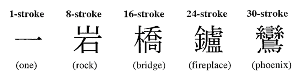
Strokes are the basic building blocks of Chinese characters, consisting of individual lines or marks. A simple character like “一 (one)” is made up of just one stroke, whereas more complex characters can involve dozens. Precise rules dictate stroke order, promoting consistency and legibility in handwriting.
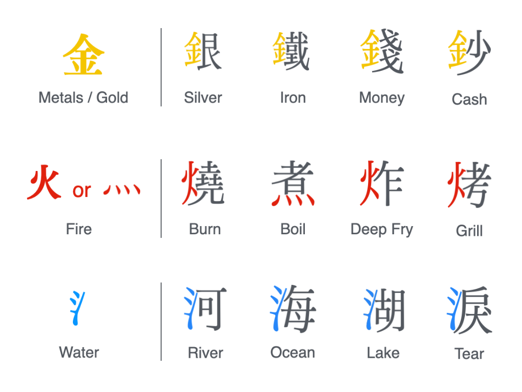
Radicals Traditional Chinese organizes all characters based on 214 radicals (while Simplified Chinese uses 189), which are arranged by stroke count in a chart called 部首 (bùshǒu). Each radical is also a standalone character or word., on the other hand, are recurring elements that provide clues to a character’s meaning or pronunciation. For example, the radical “金 (gold)” shows up in characters tied to metals, “火 (fire)” appears in those linked to burning, and “氵(water)” is found in characters associated with liquids. Beyond offering hints about meaning, radicals also serve a practical purpose, organizing characters in dictionaries and acting as guideposts within the vast landscape of the writing system.
The Scope of a Chinese Characters
Chinese boasts one of the world’s oldest and most intricate scripts, with over 100,000 documented characters. However, in practical daily life, a much smaller subset suffices, typically 3,000 to 4,000 characters are enough to navigate most common situations. Mastery of this core set allows for functional literacy, though the full scope of the language’s vast character pool remains a testament to its rich cultural and historical.
This vast system, however, isn’t uniform. Chinese typography splits into two primary forms: Traditional Chinese Traditional Chinese, predominantly used in Taiwan, Hong Kong, and Macau, retains the script’s historical depth with its higher stroke counts. and Simplified Chinese Simplified Chinese, the standard in China and parts of the diaspora like Malaysia and Singapore, was introduced to improve efficiency and literacy by reducing complexity.. Each carries its own history, usage, and design nuances reflecting both cultural heritage and modern evolution. Understanding the distinction between these two scripts is crucial for anyone exploring Chinese typography, as they shape how characters are written, and designed across different regions and contexts. So, deciding between them depends on regional preferences or the specific needs of a project.
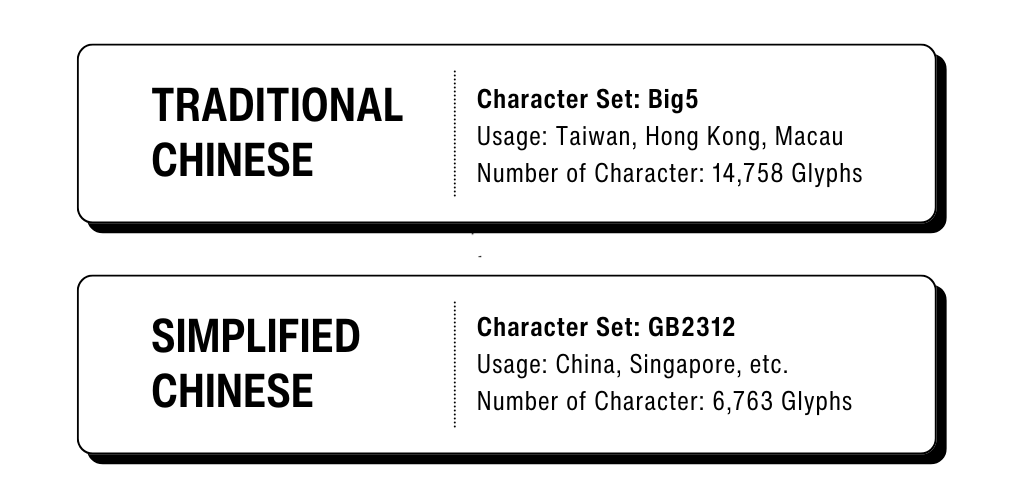
Big5 vs. GB2312
Big5 and GB2312 (later expanded by GB18030) are key standard character set for Chinese text in the digital realm. Big5 tailored for Traditional Chinese, supports a wide range of characters with intricate stroke patterns, preserving their historical forms. It remains widely used in legacy systems across Taiwan, Hong Kong, and Macau to this day.
On the other hand, GB2312 designed for Simplified Chinese, prioritizes characters with reduced stroke counts, reflecting China’s emphasis on simplified literacy. Later expansion GB18030, expands this framework with broader character support, meeting modern demands while maintaining the efficiency of the Simplified script. To learn more about Common Digital Character Sets, feel free to check out this link.
Timeframe for Crafting a Chinese Fonts
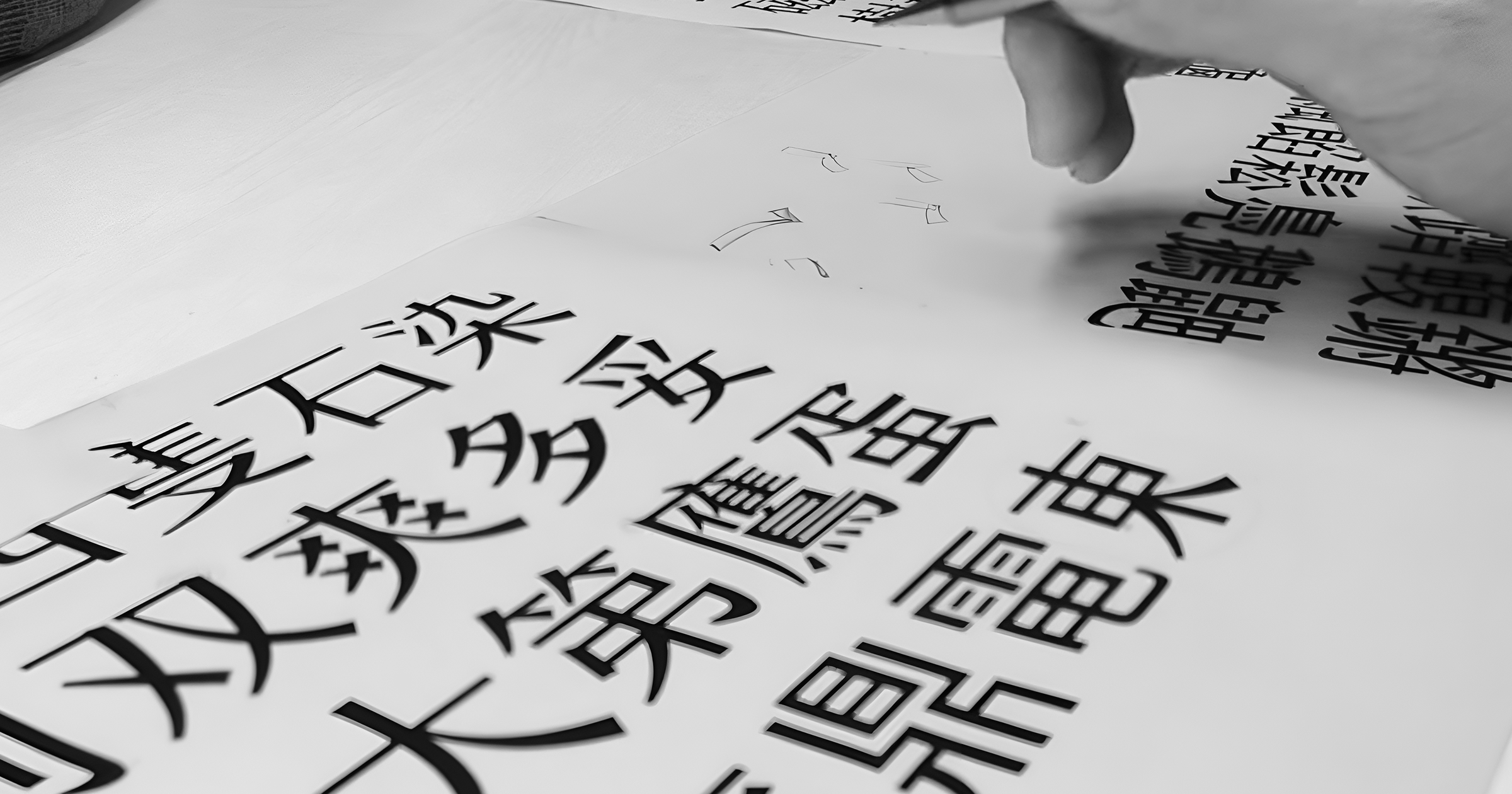
Creating a Chinese typeface far outpaces the timeline for a Latin one due to the sheer volume of characters involved. A complete Traditional Chinese typeface, with up to 14,000 characters, can take 2 to 5+ years. Each character’s detailed strokes and structure demand uniformity and legibility—a monumental task.
A Simplified Chinese typeface, with around 7,000 characters and fewer strokes, shaves this down to 1.5 to 3+ years, though it still requires painstaking care for cohesion. By contrast, a Latin typeface, varying from just 200–500 glyphs (letters, punctuation, and symbols), wraps up in 3 months to 1.5 years.
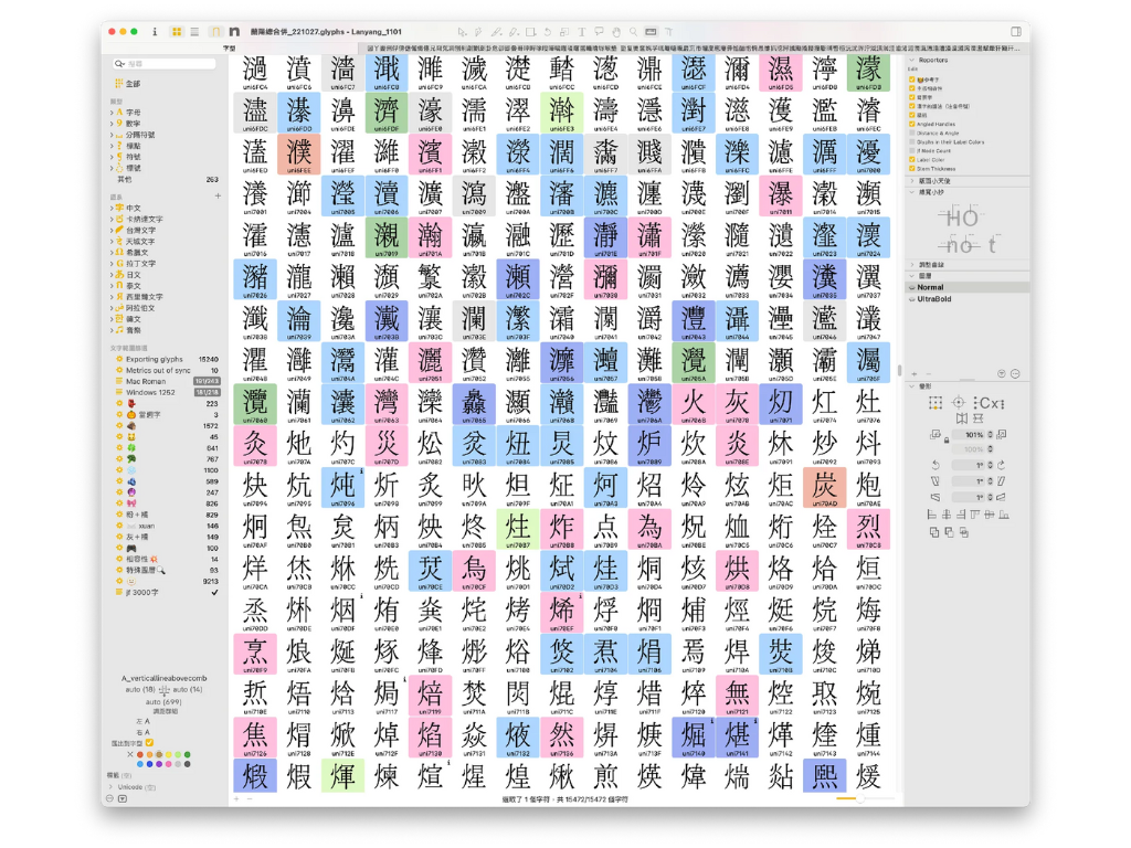
Due to the extensive workload, Chinese typography typically require collaboration among multiple designers as a team project. This is why many foundries adopt modular design approaches, AI-assisted glyph generation, or start with a core character set before expanding. In some cases, manually designing a complete Chinese typeface can even take decades.
Daily Output in Chinese Type Design
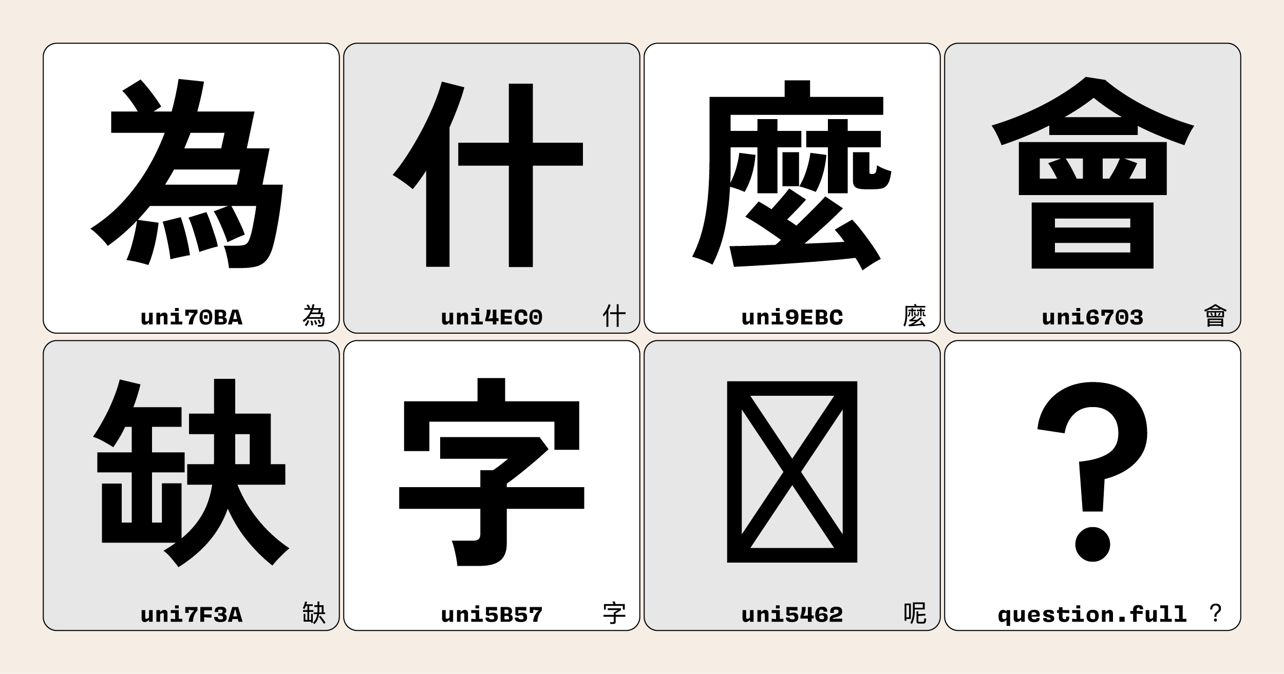
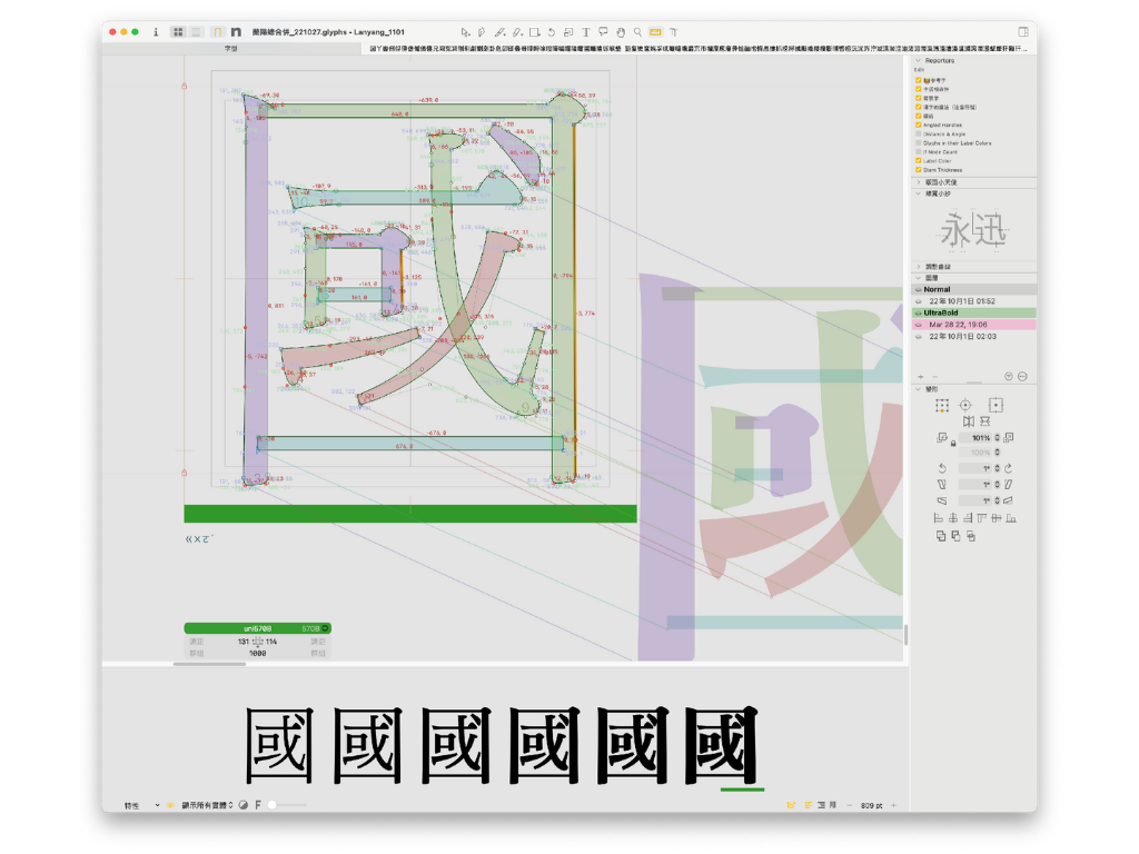
The rate at which Traditional Chinese characters are designed depends on a designer’s expertise, the typeface’s complexity, and the project’s aims. Based on insights from the justfont team’s work on the JinXuan typeface, a single type designer typically produces 10–15 characters daily. For more elaborate or innovative styles, such as those featuring calligraphic flourishes or striking, unconventional strokes, this drops to 5–8 characters, even for experts.
With a functional Traditional Chinese typeface requiring 7,000 to over 13,000 characters, a single designer could take 2–4 years to complete the set. Teams often split the tasks, hastening the timeline significantly. And, the process feels lengthy because each character demands meticulous care, its strokes, balance, and proportions must remain precise and consistent from the first design to the last, ensuring a cohesive and harmonious typeface throughout.
Pricing of a Traditional Chinese Fonts
Evaluating the pricing structure of traditional Chinese fonts in Taiwan requires a nuanced understanding of the contrasting business models prevalent in the market, primarily distinguished by perpetual buyout options and subscription-based services. Companies such as justfont, Arphic (part of Morisawa), and DynaFont (by DynaComware) exemplify these approaches, tailoring their offerings to meet diverse professional and creative demands.
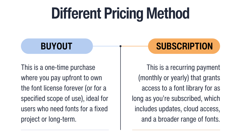
Perpetual Buyout Options
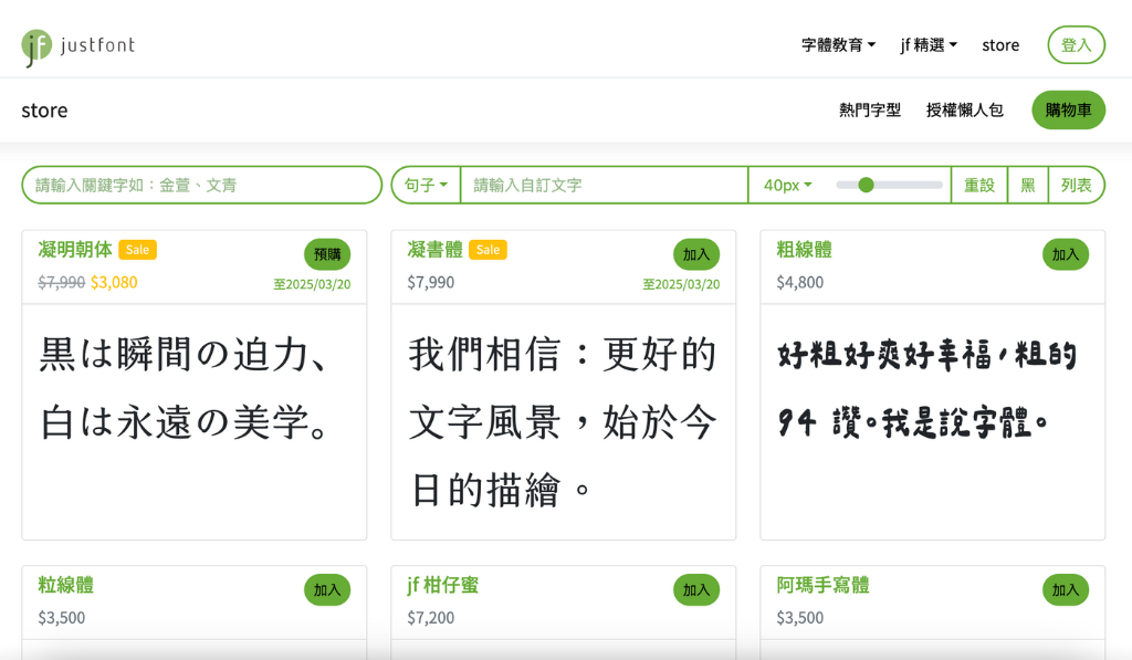
The buyout model provides a one-time purchase for perpetual font ownership, appealing to users prioritizing long-term value and cost predictability. For example, justfont offers licenses ranging from NT$3,000 to NT$15,000 (approximately USD $100–$500), encompassing both personal and commercial applications. A single license allows installation and use on up to two devices, and its perpetual nature permits worldwide commercial application. A detailed license guide can be found here.
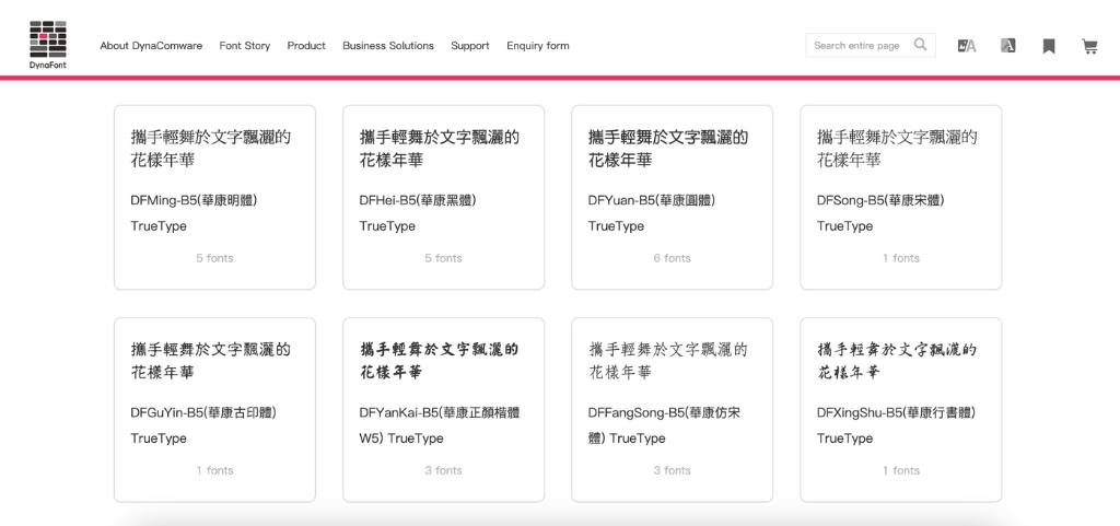
DynaFont offers perpetual licenses span NT$2,500 to NT$5,000 per font (USD $75–$150), with flexible licensing options designed for various usage needs. Whether for commercial or non-commercial purposes, all applications of DynaFont products require a formal licensing agreement and associated fees. This model is particularly beneficial for design firms and corporations looking to make a one-time investment in long-term projects, such as brand identity development.
Subscription-Based Service
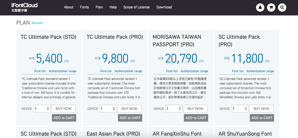
In contrast, the subscription model prioritizes access to extensive font libraries and continuous updates, catering to organizations with evolving requirements. For example, iFontCloud, a cloud-based font subscription service by Arphic, offers annual subscriptions tailored to Traditional Chinese fonts. The basic package, AR TC Designer Collection, starts at NT$4,700 (USD $145) and includes a total of 11 fonts, featuring handwriting, classic calligraphy, and additional styles. Meanwhile, the advanced version, TC Ultimate Pack, provides the most complete set of Traditional Chinese font package with over 632 fonts selection, starting at NT$9,800 per year (USD $320). Arphic also offers packages that support Simplified Chinese or Japanese, including a selection of Morisawa’s products.
Similarly, the DynaFont Treasure plans provide annual licensing, start with DynaFont Treasure Basic at NT$3,600 yearly (USD $120) for basic access and personal use, such as limited font sets for print publications. Higher-tier options DynaFont Treasure Professional, which include multimedia, web, and other professional needs, range from NT$24,000 annually (USD $800), depending on licenses that you purchase. This approach benefits businesses and creators who looking for scalability and variety, though it involves ongoing subscription costs.

Production Cost Traditional Chinese Fonts
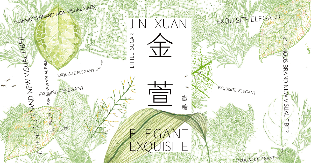
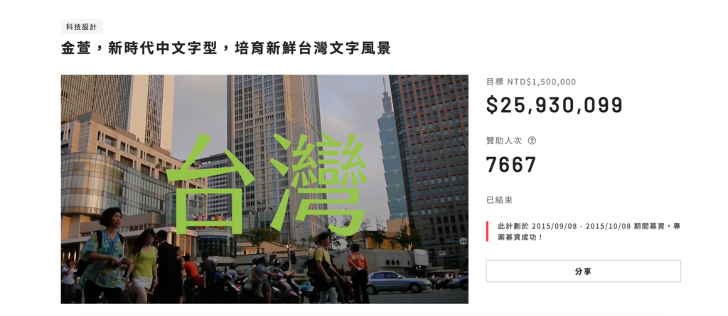
Building a Traditional Chinese typeface is a resource-intensive endeavor. Take justfont’s JinXuan project in 2015: this Taiwanese initiative sought to craft a typeface for local users, raising NT$26 million (roughly US$818,400) via crowdfunding in a single month, surpassing beyond its NT$1.5 million (about US$46,000) as an initial target. The substantial production cost of a Traditional Chinese typeface stems from the sheer complexity and volume of characters involved. As mentioned above, a complete Traditional Chinese typeface demands thousands, often exceeding 14,000 characters for full Unicode support. Each character must be meticulously crafted to maintain visual harmony, requiring skilled designers, specialized software, and extensive quality assurance. Additionally, adjustments for different weights, styles, and display sizes add further complexity.
Design labor, expenses also include licensing fees for font development tools, testing across multiple platforms, and compensating type designers, engineers, and linguists to ensure accuracy and readability. Beyond design and production, effective marketing, community engagement, and a strong brand presence played a crucial role in its crowdfunding triumph. These factors collectively push production costs into the mid-to-high six-figure range, making crowdfunding and pre-sales crucial strategies for sustaining such large-scale projects.
Final Thoughts
Designing a Chinese typeface is an immense challenge. Every stroke, balance, and detail, down to the font’s distinct personality, demands meticulous precision. The process often takes years and significant resources, with the finest results reflecting a harmonious blend of artistry and technical expertise. For non-Chinese designers, immersing themselves in this craft not only deepens their appreciation for its complexity but also broadens their creative perspective. As more designers engage with Chinese typography, they contribute to a richer, more inclusive global design landscape, one that respects tradition while embracing innovation.
Ultimately, type design is more than just creating functional letterforms; it is a bridge between culture and communication. By understanding and honoring the intricacies of Chinese typography, designers help preserve its heritage while pushing the boundaries of typographic expression for future generations.