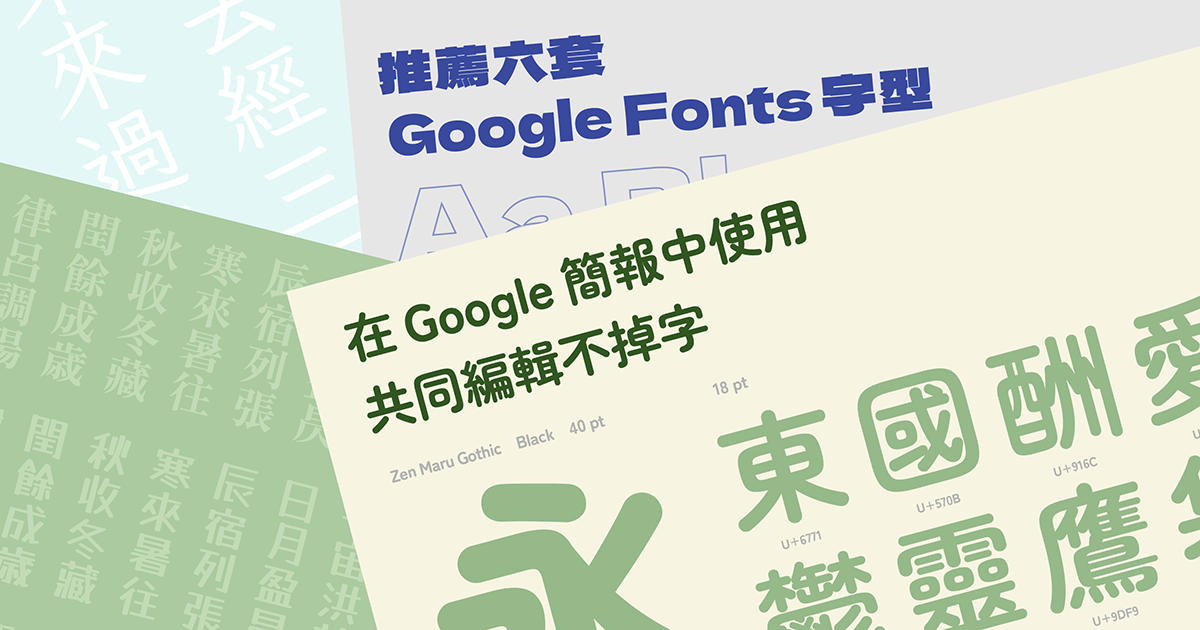
Google Fonts is an online service that offers hundreds of open-source fonts in different languages. It allows users to find the font they need quickly and for free.
Don’t be discouraged if a direct search for “Chinese Font” doesn’t yield many results. Instead, consider exploring Japanese fonts. Japanese Kanji often covers the basic needs of Chinese characters, offering a wealth of choices when working with Chinese materials.
Here are some Japanese fonts that might fill your needs, and they are free to use! These fonts, with their variety and suitability for different design needs, can be a valuable addition to your font collection.
Basic Fonts that Suit Every Occasion
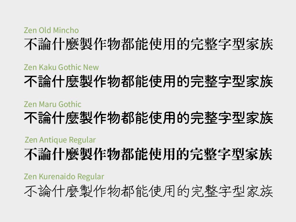
Basic fonts are the pain t-shirts in your closet that can never go wrong. In the Chinese typesetting and printing industry, basic fonts refer to the five styles: Ming Ti, Hei Ti, Rounded, Kai Ti, and Fang Song Ti. Each of the styles has its own characteristics while not being too showy and is commonly used in signs, posters, documents, texts and displays.
A Touch of Tradition While Easy to Read: Zen Old Mincho
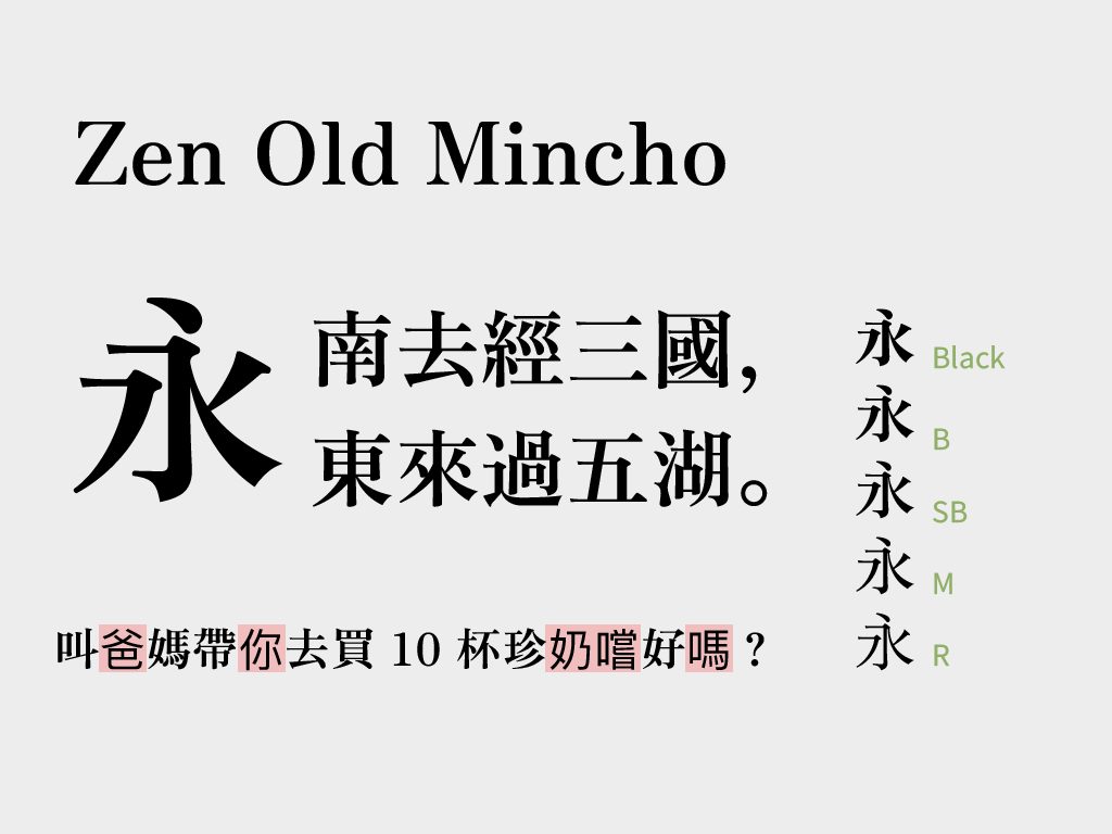
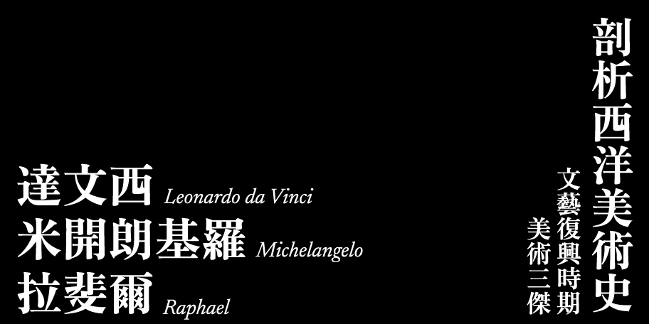
Among the Ming typefaces available on Google Fonts, Zen Old Mincho stands out as a prime choice. The designer, Yoshimichi Ohira, originally worked as a typesetter. After seeing a vast number of characters and recognizing certain needs, he began designing fonts in his spare time. Zen Old Mincho is the first typeface he completed, drawing from over a decade of experience in typesetting.
Yoshimichi Ohira aimed for Zen Old Mincho to carry forward the aesthetic tradition of Japanese typography while also meeting the clarity requirements of digital typesetting. Since its release in 1997, it has become a commonly used typeface in Japanese newspapers, advertising, and other media.
Most of the Ming typefaces available on Google Docs feature ink traps, which, though beautiful, are not suitable for general documents and often lack a variety of weights. Zen Old Mincho, with its clean yet refined design and five available weights, offers versatile applications, which is why we recommend it.
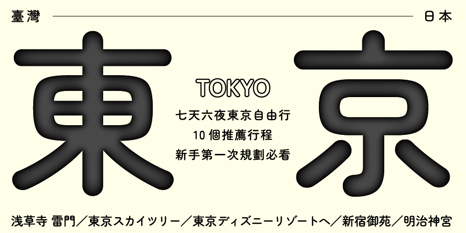
Soft, cute, and a touch of elegance: Zen Maru Gothic
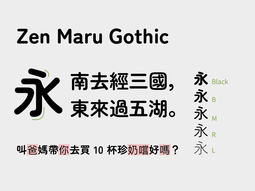
After designing Zen Old Mincho, Yoshimichi Ohira continued to develop the Zen series. He envisions the Zen series as “a comprehensive family of typefaces that are beautiful, easy to read, and suitable for any project, capable of enduring for a century.” This includes the Zen Maru Gothic, which features soft, cute, rounded lines.
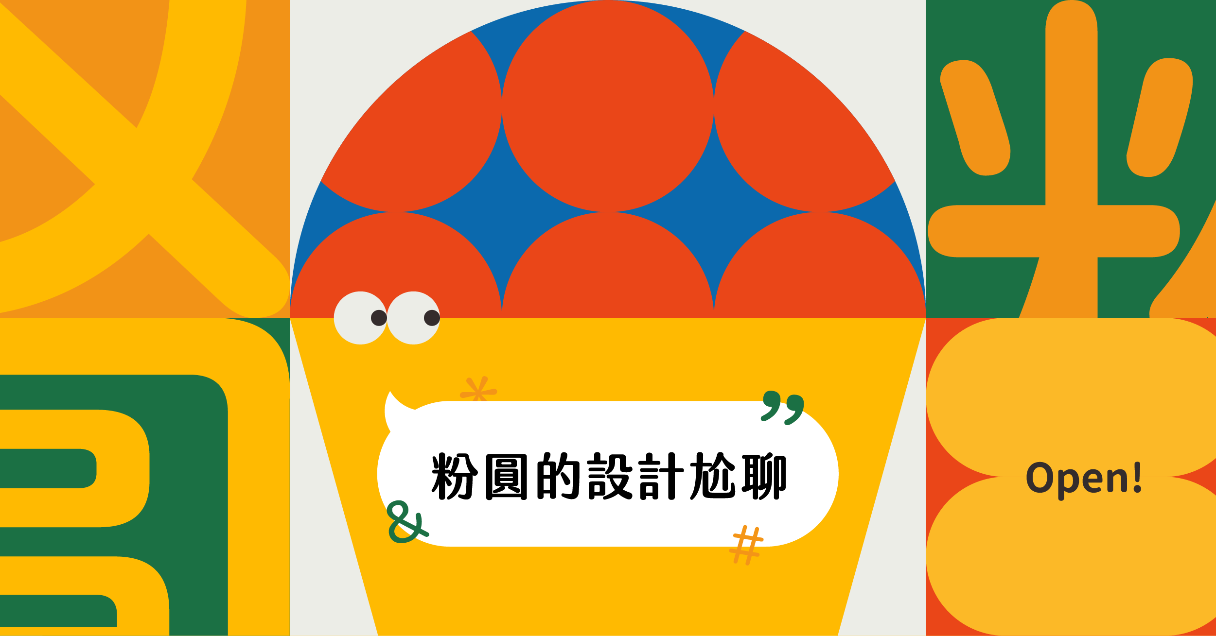
Zen Maru Gothic is even rounder than typical rounded typefaces, with not just rounded strokes but also slightly curved structures, making it appear softer. Yoshimichi Ohira carried forward the design philosophy of Zen Old Mincho by finding characters with a traditional aesthetic from early publications, adding a touch of Japanese elegance to Zen Maru Gothic.
Despite its cute and gentle appearance, Zen Maru Gothic is still a highly legible typeface, especially suitable when conveying a relaxed and warm feeling. Zen Maru Gothic can be easily used for both main headlines and annotations with its five weights, providing a comfortable reading experience.
The blend of technology and human experience: IBM Plex Sans JP
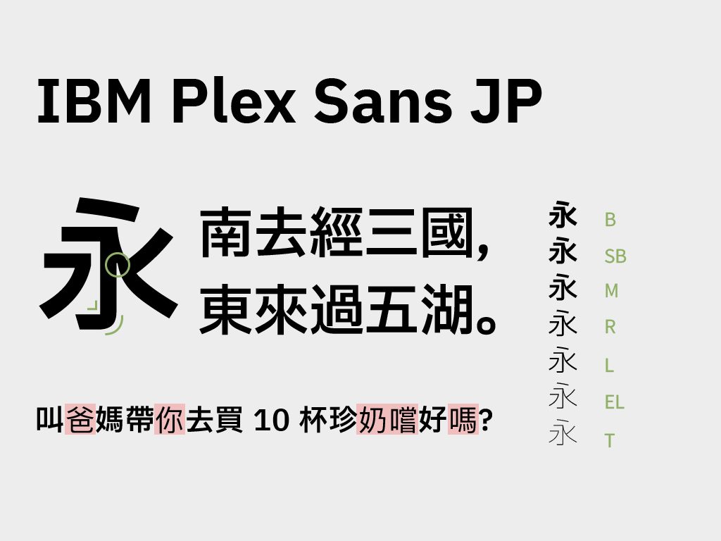
IBM Plex Sans JP is a custom typeface released by the well-known tech giant IBM. It features mechanical horizontal and vertical strokes combined with natural, humanistic curves. The design also emphasises legibility, with open counters and clear strokes, making it suitable for screen reading and projection.
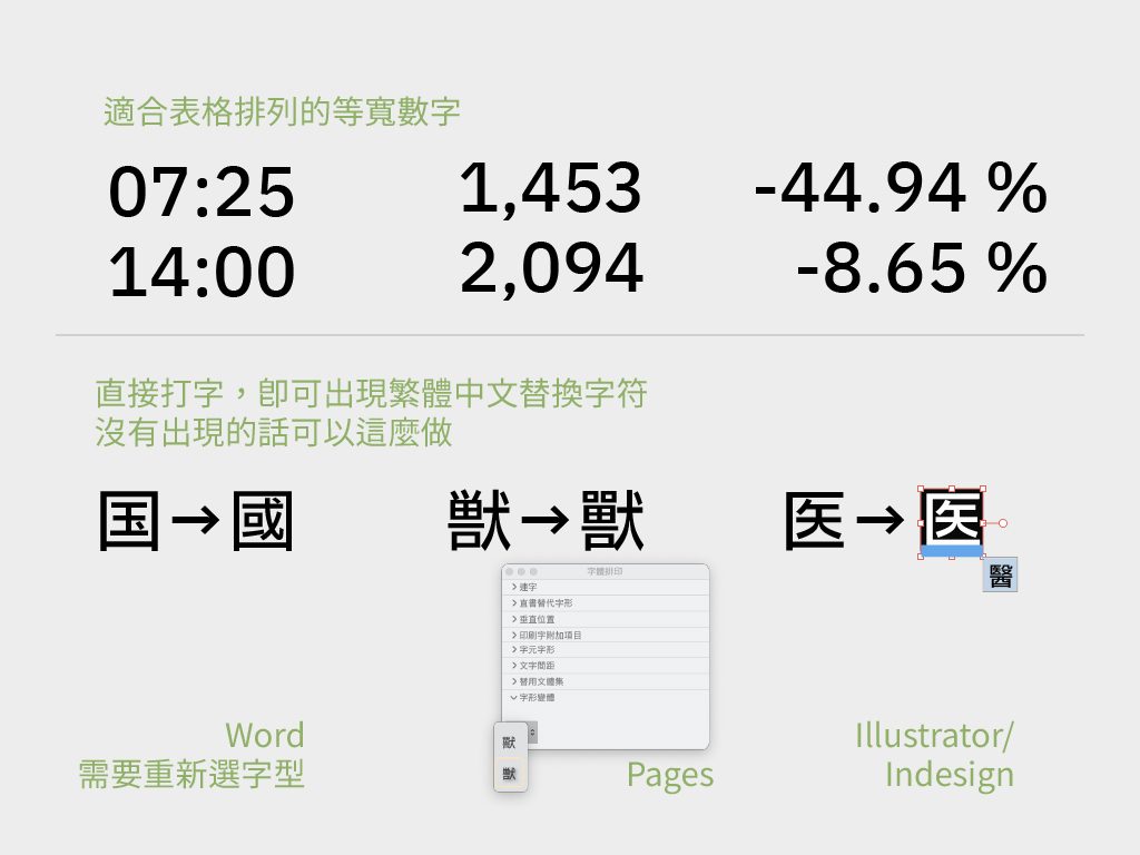
IBM Plex Sans JP includes many Traditional Chinese alternate characters and supports over 100 languages in the full series. A Traditional Chinese version is expected to be released in 2024. It’s worth mentioning that the IBM Plex Sans series features monospaced numerals, making it easy to align numeric columns when creating reports and resulting in clearer documents.
With its broad support and clear yet not overly cold design, IBM Plex Sans JP is particularly well-suited for technology-related themes. However, it currently doesn’t work on Google Docs, so you’ll need to download and install it for use in standard word processing software.
Clean and crisp with a handwritten pen style: Klee One and Iansui
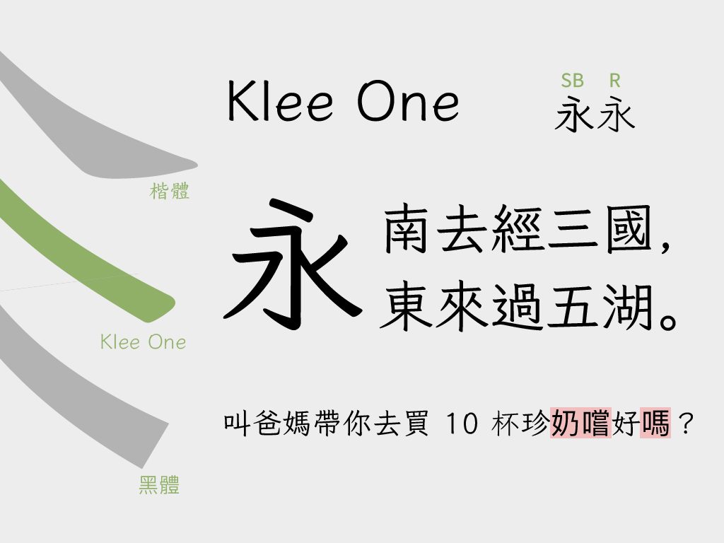
Although basic fonts include Kai and Fangsong styles, they are not available on Google Fonts. Instead, we recommend Klee One, which, though stylistically different, has a certain humanistic handwriting feel while maintaining stable readability.
The Taiwan Ministry of Education mandates that elementary school Chinese textbooks use BiauKai (DFKai-SB), while Klee One is one of the textbook fonts in Japan. Its wide counters and stable strokes make Klee One a very comfortable reading experience. The stroke design lacks the dramatic force variations of the Kai style and isn’t as square and sharp as the Hei style. It resembles more of a casual handwritten pen style, which makes Klee One appear more friendly (for a more detailed introduction, check out this article).
With its two weights, Klee One can easily distinguish text hierarchies. Still, it’s prone to missing Traditional Chinese characters in long texts, so it’s recommended for use in titles, subtitles, explanatory text, and annotations.
In 2025, Iansui, created by But Ko based on Klee One, is added to Google fonts. Iansui supplements commonly used Traditional Chinese characters and Formosan languages writing system. If you’re looking for a font that helps you communicate better with local Taiwanese, Iansui will be the best choice.
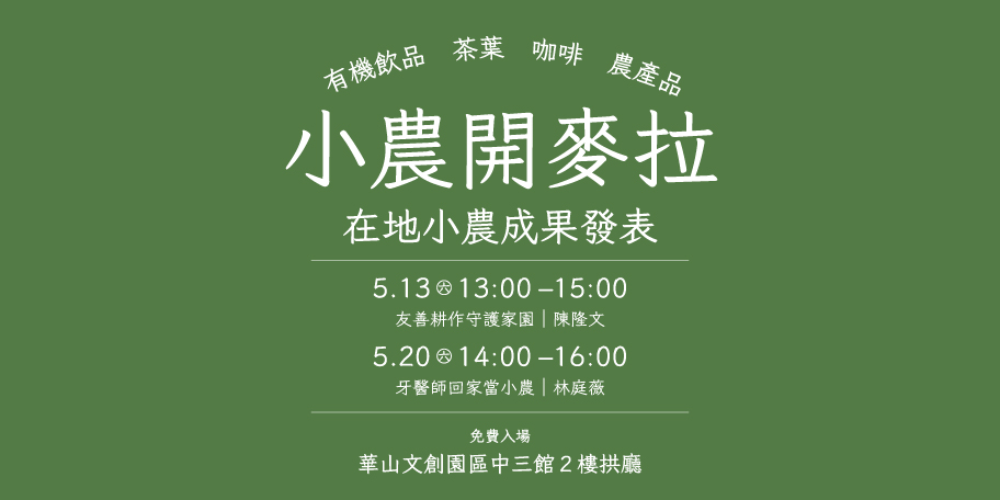
Distinctive and eye-catching font choices
Beyond versatile basic fonts, are there times when you need something more eye-catching, lively, and distinctive? Here are a few strong-character fonts to add some flair to your work!
The bold presence of Dela Gothic One
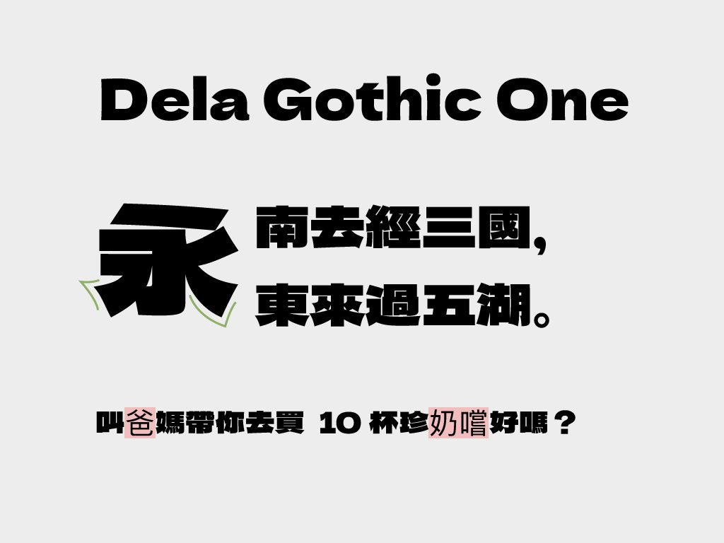
Designed by Arakana, Dela Gothic One is a wide, ultra-bold Gothic typeface. Its ultra-bold lines emphasise the weight of the text, making it very striking. The slight trumpet-shaped terminals at the ends of strokes and the larger-than-usual curvature angles make this loud font a bit softer, adding a touch of playful charm.
Creating a recognisable, ultra-bold, ultra-heavy typeface for Traditional Chinese has always been a challenge due to the number of strokes, resulting in very few options on the market. Common loud typefaces like MStiffHeiHK UltraBold (Monotype) or Burn Font completed by justfont friends’ Lin Fangping are characterised by square, boxy shapes that convey a loud and resolute feeling. Dela Gothic One’s slightly rounded and flexible curves offer another option in the realm of ultra-bold typefaces, making it suitable for the titles of lighthearted events.
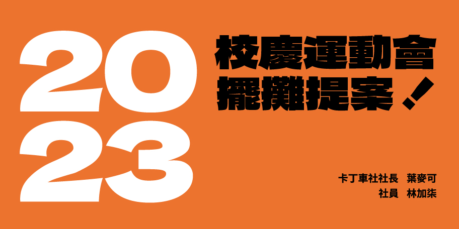
Some users have expanded the Chinese characters of Dela Gothic One and adjusted the punctuation positions to create Mantou Black, a font suitable for basic use in Taiwan.
Playful POP advertisement style: Yusei Magic
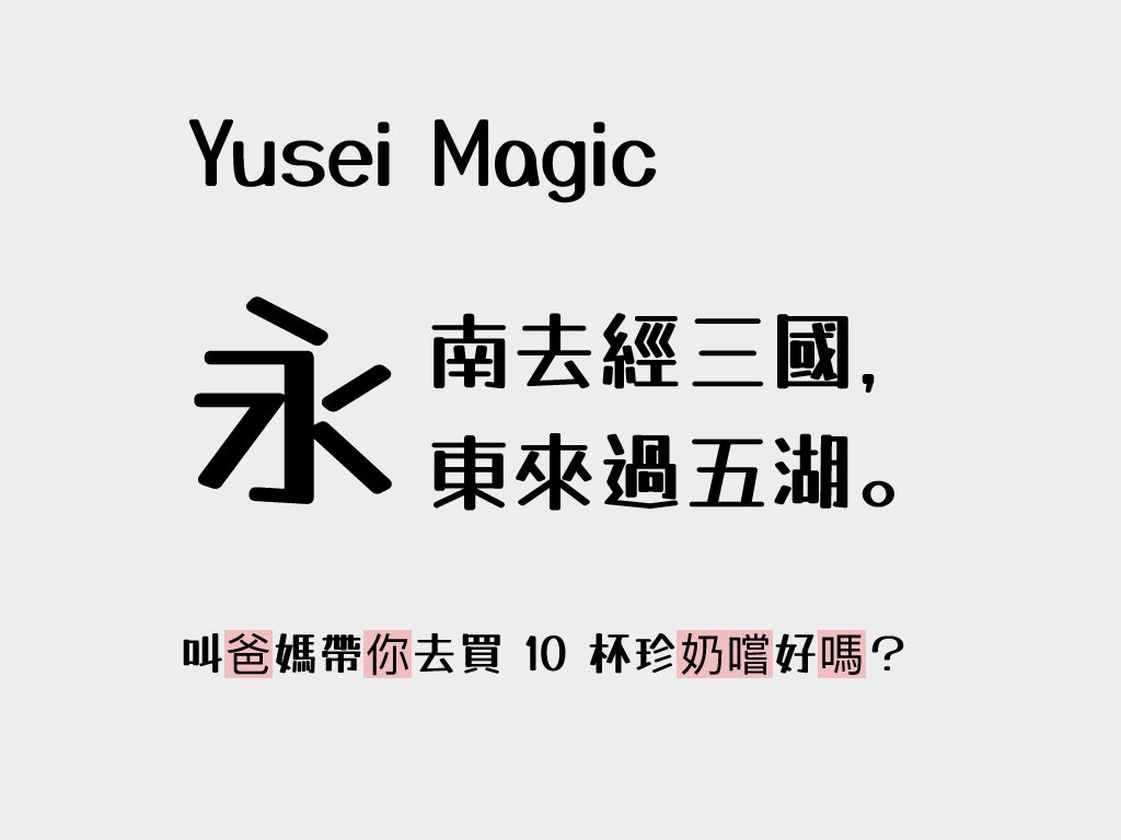
Have you ever seen those POP handwritten signs often found in the Taiwanese market? You can find them in Google Fonts too! Yusei Magic is a font that carries that marker pen POP style. Designer Tanuki previously released an open-source marker pen-style font called Tanuki Yusei Magic.
If Tanuki Yusei Magic was an expression of style, then Yusei Magic is the result of balancing style with legibility. Yusei Magic references Tanuki Yusei Magic’s stroke design, maintaining contrast while enhancing the horizontal strokes for better readability, evolving into a typeface that balances style and legibility. The earlier version’s issues with unclear English letters and narrow counters, which made reading difficult, have also been improved in Yusei Magic.
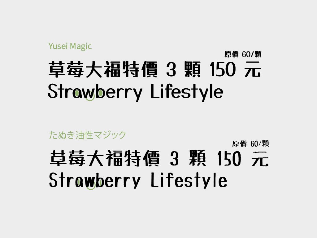
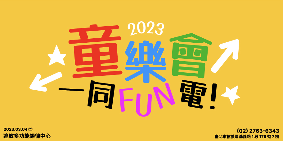
Yusei Magic’s marker pen handwriting conveys a relaxed and playful atmosphere, making it particularly suitable for titles in parent-child activities. However, despite being more stable than its predecessor, it’s still not recommended for formal occasions or long body text, as it can strain readability.
Retro 16-Bit Digital World: DotGothic 16
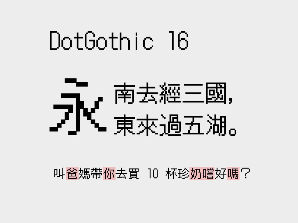
Users say, “I want to replicate the look of a mobile or computer screen in print,” and that’s how DotGothic 16 came about. Fontworks, the Japanese type foundry, describes this font on its introduction page with such simplicity. For the same reason, Fontworks also developed DotGothic 12, DotMincho 12, and DotMincho 16, four different grid-point Ming and Gothic typefaces, of which only DotGothic 16 is available on Google Fonts.
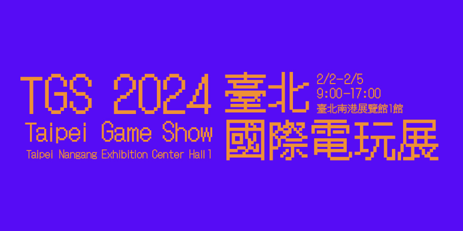
Due to limitations in computing power and screen display in the early days, text had to be presented in grid points. With significant technological advances in computing performance and screen display, bitmap fonts gradually disappeared from computers and phones. Although they can still be seen on LED displays, bitmap fonts have become a major element of retro, nostalgic electronic themes. However, these highly distinctive bitmap fonts also have readability issues, so they’re not recommended for body text (imagine how uncomfortable it would be to read small text on a low-resolution screen!).
This article is translated from Google Fonts 的字體:漢字篇, with the help of chatGPT.
